I think “modern” can be interpreted as nice and clean UI which is beautiful to watch and only the absolutely most important stuff is shown and the rest is hidden. So, like apple design approaches, I guess. Say form over function.
Microsoft tends to go that route as well. Luckily for user who like function over form, there are different flavors of Linux.
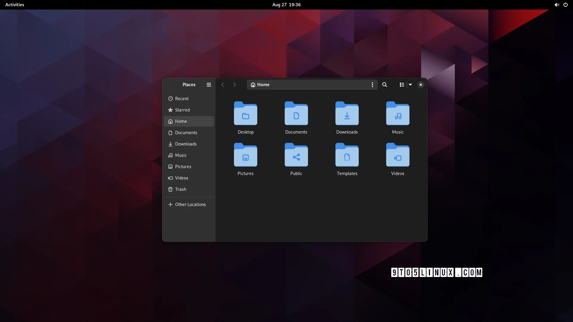
Clearly the dark mode is the modern one! Jokes aside, I just realized that there THREE menu options on that toolbar: hamburger, kebab, and waffle! I realize they do different things, but no wonder people are confused by and scared of computers. Also, now I’m hungry!
as someone who’s not scared of computers, i have no idea what they do. i assume the right one is icons/list/compact[1] not a waffle menu, but the hamburger and kebab? i have no clue
though why it’s showing list when the current view is icons, i don’t know either ↩︎
It has the same options as right clicking on an empty space in a directory. Stuff like Create a new folder, Create a new file, that sort of thing. “Actions you might wanna make on this directory”. When you start searching, there is another button that appears and that one is the one that let you filter search options
I dont see the usefulness of that button tbh. Its like it assumes good ol right click isnt discoverable on its own. Idk anyond who has a mouse and hasnt pressed right click ever.
maybe; but if the location of menu buttons hints at their use then the hamburger should collapse the side drawer like the one on e.g. youtube, but i doubt it does
i’m not even sure it’s worth having an option. i don’t think i’d even have noticed a difference, apart from the menu button being in a slightly different place to every other gnome app. it’s fine; but it wasn’t worth the development time
The last thing I want is an option for this. My gosh, imagine the amount of options you would end up with if every single design choice was turned into an option. Who in the world would like that many options.
I’m happy to just have a design team work on whatever they think looks better and works best for the user experience, and implement it after some rounds of public review and testing. This looks neat enough to me - slightly less cluttered than what my current Nautilus window looks like while maintaining the same functionality.
Seriously, I envy you guys. Every time I try to use Plasma, I end up spending all my time tweaking the desktop, and by the time I’m done, I realize I’ve just recreated the Gnome workflow…
I had to look up Fitts’s law, and I’m not sure I get it. Could you explain what you mean?
ETA: I kinda feel like mine was about KDE not being a fit for me personally, and yours was a slam on Gnome rather than a statement of personal preference.
It’s just my opinion (since it’s not in the article) but a thing that makes Gnome and Libadwaita a “modern design” is the fact that the production behind it tries to bridge the gap between a “mouse and keyboard” and a “touch screen” workflow.
None of the other DEs come even close to Gnome when used on a tablet
meh, subjectively i find that creates a “worst of both worlds” situation. but this comment was more about the futility of the development time that went into this specific feature
this comment was more about the futility of the development time that went into this specific feature
yeah sorry, I should have been more specific with my answer: features like this are supposed to help you in a touch screen situation or in general with smaller screens.
When the window is resized under a certain size, the left panel becomes hidden and with it part of the top bar, to make it less cluttered and confusing.
The difference is minimal, in the newer version you have 1 less element when the sidebar is collapsed (the hamburger menu).
Generally speaking Gnome 44 is already well optimized, 45 is going to be a more “tweaks and small improvements” kind of update rather than a big design changes

who even decides what’s “modern” anymore?
can anyone, honestly, without reading the article (or guessing from the headline), tell me which of these is the "modern" design?
edit: people are getting confused by the fact that one is tree view, not icons view so i changed the image. old image here
Apparently “modern” means hiding options behind extra clicks
i may be blind but what exactly was hidden behind one or more clicks?
I think “modern” can be interpreted as nice and clean UI which is beautiful to watch and only the absolutely most important stuff is shown and the rest is hidden. So, like apple design approaches, I guess. Say form over function. Microsoft tends to go that route as well. Luckily for user who like function over form, there are different flavors of Linux.
Clearly the dark mode is the modern one! Jokes aside, I just realized that there THREE menu options on that toolbar: hamburger, kebab, and waffle! I realize they do different things, but no wonder people are confused by and scared of computers. Also, now I’m hungry!
TIL of kebab and waffle menus.
as someone who’s not scared of computers, i have no idea what they do. i assume the right one is icons/list/compact[1] not a waffle menu, but the hamburger and kebab? i have no clue
though why it’s showing list when the current view is icons, i don’t know either ↩︎
Since the kebab menu is inside the location/search box, I’m guessing it contains search-related options.
It has the same options as right clicking on an empty space in a directory. Stuff like Create a new folder, Create a new file, that sort of thing. “Actions you might wanna make on this directory”. When you start searching, there is another button that appears and that one is the one that let you filter search options
I dont see the usefulness of that button tbh. Its like it assumes good ol right click isnt discoverable on its own. Idk anyond who has a mouse and hasnt pressed right click ever.
That would be useful on a tablet, where right-clicking is impossible.
maybe; but if the location of menu buttons hints at their use then the hamburger should collapse the side drawer like the one on e.g. youtube, but i doubt it does
It’d be kinda nice if they made these kinds of changes options rather than just deciding this is best
Could honestly take it or leave it, doesn’t really add anything
i’m not even sure it’s worth having an option. i don’t think i’d even have noticed a difference, apart from the menu button being in a slightly different place to every other gnome app. it’s fine; but it wasn’t worth the development time
The last thing I want is an option for this. My gosh, imagine the amount of options you would end up with if every single design choice was turned into an option. Who in the world would like that many options.
I’m happy to just have a design team work on whatever they think looks better and works best for the user experience, and implement it after some rounds of public review and testing. This looks neat enough to me - slightly less cluttered than what my current Nautilus window looks like while maintaining the same functionality.
KDE fans?
Awww, Plasma fans, you know I’m playin’.
yep, that’s me
Seriously, I envy you guys. Every time I try to use Plasma, I end up spending all my time tweaking the desktop, and by the time I’m done, I realize I’ve just recreated the Gnome workflow…
That’s the neat thing. It’s so customizable, you can turn it into another desktop environment.
I mean, almost. I can pull it off on my desktop, but I can’t get the touchpad/touchscreen gestures to work right on my laptop.
Kinda looking forward to Plasma 6 to play around with, though. Might even be enough to get me to switch for a while!
I tried KDE, it’s cool but I get the same thing of trying to recreate gnome/pantheon
It kinda sucks in GNOME when there’s just one thing you would like to change though
Have been trying to get a tiling window manager on GNOME but all the gnome extensions that do it kinda suck
Really? I’m not a tiling WM kinda guy, but I thought Forge was decent.
every time i try to use gnome, i end up spending all my time going “dammit, where are all the bleeding features”
(also the lack of fitts’ law adherence due to that pointless bar at the top)
I had to look up Fitts’s law, and I’m not sure I get it. Could you explain what you mean?
ETA: I kinda feel like mine was about KDE not being a fit for me personally, and yours was a slam on Gnome rather than a statement of personal preference.
It’s just my opinion (since it’s not in the article) but a thing that makes Gnome and Libadwaita a “modern design” is the fact that the production behind it tries to bridge the gap between a “mouse and keyboard” and a “touch screen” workflow.
None of the other DEs come even close to Gnome when used on a tablet
meh, subjectively i find that creates a “worst of both worlds” situation. but this comment was more about the futility of the development time that went into this specific feature
yeah sorry, I should have been more specific with my answer: features like this are supposed to help you in a touch screen situation or in general with smaller screens.
When the window is resized under a certain size, the left panel becomes hidden and with it part of the top bar, to make it less cluttered and confusing.
but …surely you could just do the same thing with the old design? artist’s rendition:
in fact, now i look at it, it makes them look even more similar once i collapse the sidebar
The difference is minimal, in the newer version you have 1 less element when the sidebar is collapsed (the hamburger menu).
Generally speaking Gnome 44 is already well optimized, 45 is going to be a more “tweaks and small improvements” kind of update rather than a big design changes
Agreed, I’m not an expert, kind of new to linux, but I could see being very comfortable on a Gnome based tablet.
Full height sidebar - from Mac OS 7 or so - must be modern?
The first one doesn’t waste space in the title bar by expanding the locator and navigator buttons there.
Honestly, I haven’t yet seen the article, the light theme one is probably newer because of tabs.
Anyways both look like an android app, I know most will hate reading this but Windows Explorer rules.
nah, i agree with you. win explorer with qttabbar, tortoisegit, and some tweaks from winaerotweaker
dolphin is pretty good though and it has some features that explorer doesn’t, like a terminal pane
The bottom one looks like a mobile app interface, so it must’ve been the “modern” one.
“Modern” means copying Mac OS or iOS.