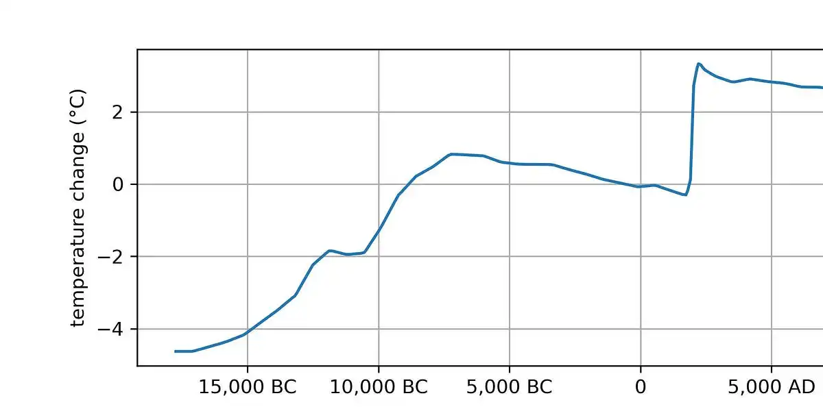
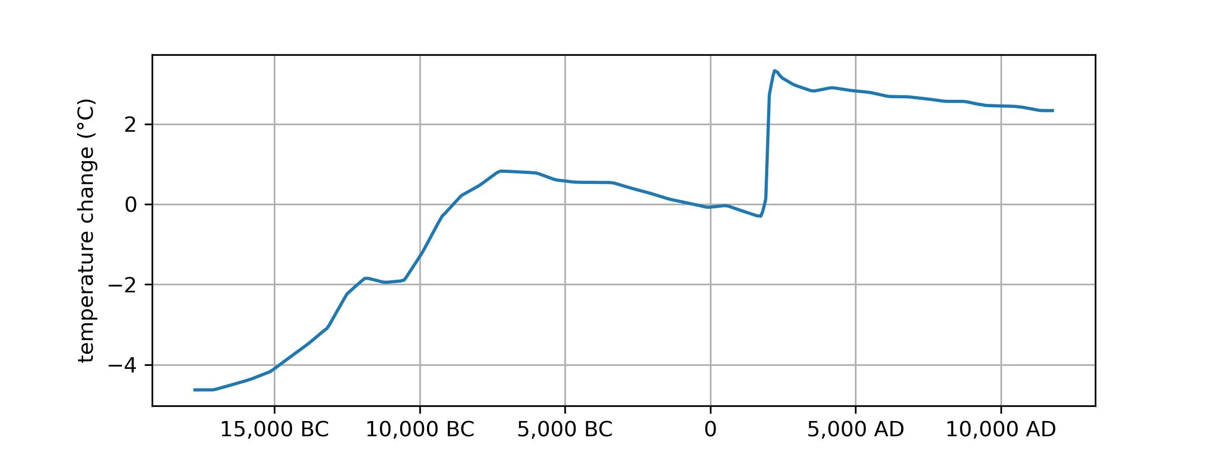
I get what’s going on here (and am scared for the future), but is this a good plot? I have no idea if 5,000 years is a meaningful term for climatology – for all I know it could have been picked just to make the 1900-2000 man-made spike look nice and vertical. You could plot no a 10,000 year scale that would make the jump from 10k BC - 5k BC look nearly as straight, and of course use a smaller scale to make shorter-term climate blips (or even weather patterns) look just as scary.
It’s a pretty good plot if you want to understand the time period where civilization has existed; it shows the warming which was going on for the few thousand years before civilization, the relatively stable temperatures during civilization, and then the sudden modern warming from fossil fuel burning, and what we expect to happen after we’re done burning fossil fuels.