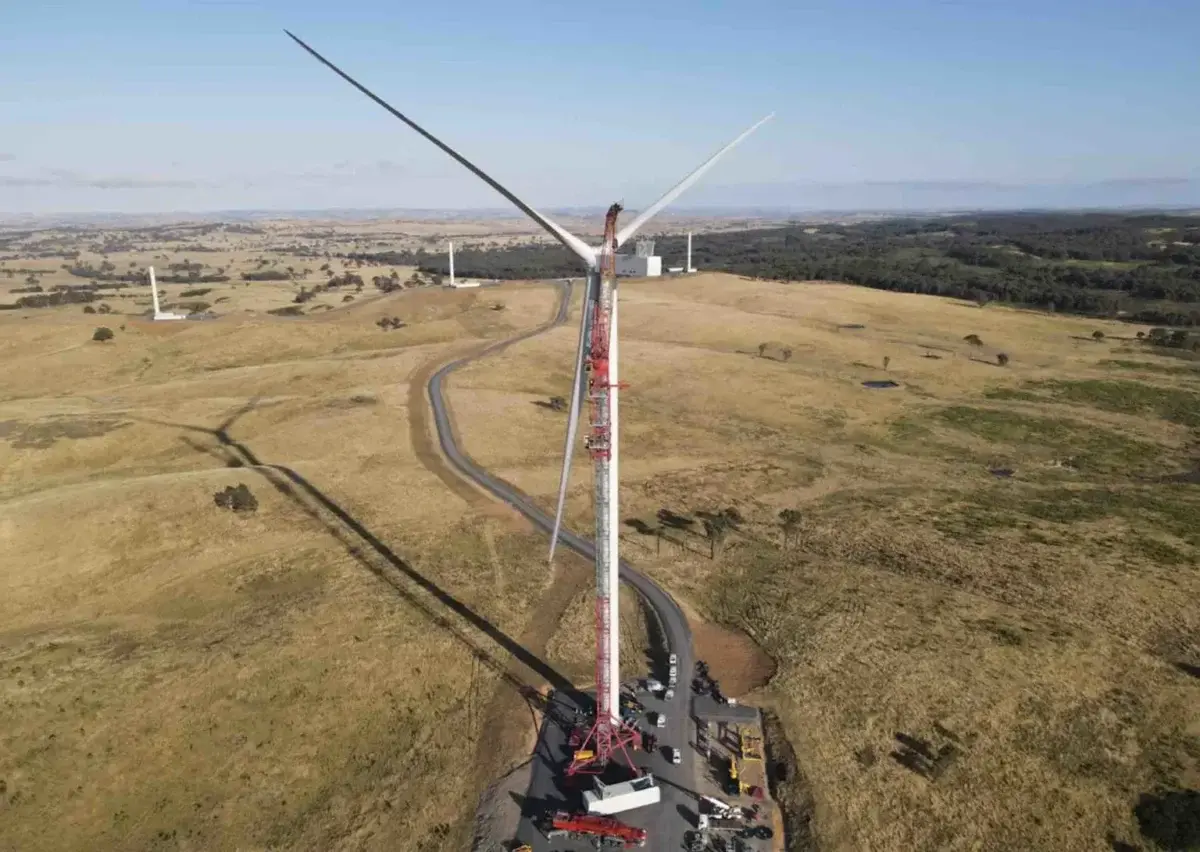
Updated: Wind industry in shock over draft NSW planning guidelines, which could kill new projects – even in renewable energy zones. Talks are being sought with the state Labor government.
They have a draft map of suitable locations for wind turbines and then filled the map with shades of green. Where green, for some reason, is a location where your application is likely to be denied.
They are supposedly using red for sites that are “desirable” for wind turbines… supposedly because that’s just according to the key on the map. There is literally no red on the map that I can see.
Keep in mind most of NSW doesn’t even have any reliable wind at all - probably the grey area of the map. To me it sends a clear message NSW just isn’t planning to allow wind power at all. They are going to keep burning fossil fuel as long as they possibly can.