The market will for sure solve thisslrpnk.netimagecross-posted to: anticorporate@lemmy.giftedmc.com boredsquirrel ( @boredsquirrel@slrpnk.net ) Data Is Beautiful@lemmy.ml • 4 months ago message-square34fedilinkarrow-up1347
arrow-up1347imageThe market will for sure solve thisslrpnk.net boredsquirrel ( @boredsquirrel@slrpnk.net ) Data Is Beautiful@lemmy.ml • 4 months ago message-square34fedilinkcross-posted to: anticorporate@lemmy.giftedmc.com
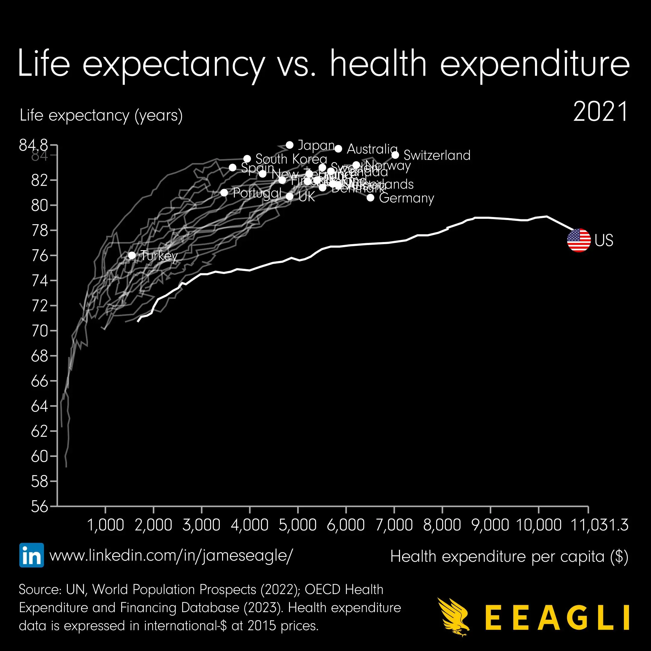
minus-square relevants ( @relevants@feddit.de ) linkfedilink5•4 months agoBut… from when? Surely expenditure hasn’t gone up linearly with time
minus-square unexposedhazard ( @unexposedhazard@discuss.tchncs.de ) linkfedilink6•edit-24 months agoYeah something is weird about this graph. Health expense in what timeframe? Monthly, yearly? If i had to guess, i would say this graph just shows the average yearly health expense of people that died at age X So people that spend more money on their health, live longer. If thats the whole message this is the most boring graph ever. If the US line is true, it shows that people there get much less value out of the money they spend on their health.


But… from when? Surely expenditure hasn’t gone up linearly with time
Yeah something is weird about this graph.
Health expense in what timeframe? Monthly, yearly?
If i had to guess, i would say this graph just shows the average yearly health expense of people that died at age X
So people that spend more money on their health, live longer. If thats the whole message this is the most boring graph ever.
If the US line is true, it shows that people there get much less value out of the money they spend on their health.