

I appreciate the graphics that they post, but this one was… Bad.
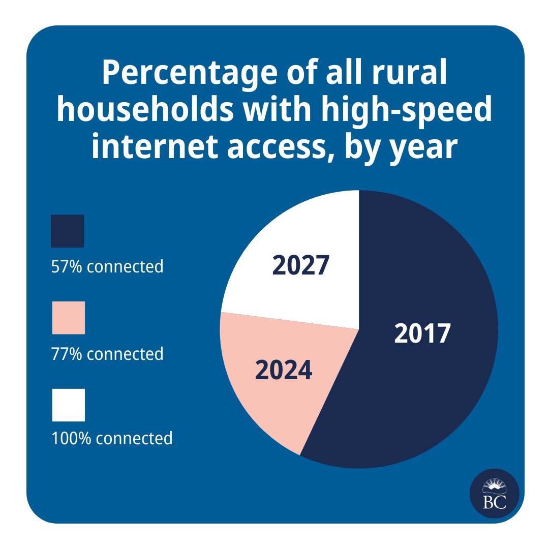
This is great news! And please also extend my deepest sympathies to whichever analyst was asked to cram this histogram into a pie chart.
They are taking the criticism in good faith though
Well, we’re taking a pie in the face on this one @[…]
We try to make info like this as clear as we can, @[…], but we don’t always get it right. Thanks for your feedback. We’re, uh, cutting ourselves a slice of humble pie.
The post: https://www.instagram.com/p/C7Pi4qAh72c/
Yea, it’s called a line chart.
Pie charts should never be used, unless you’re trying to show the progress someone is making on a personal pizza.
Even then, a bar chart or stacked bar chart would be preferable.
I used to think that, but I think they do have a place. In an array, pie charts can be a quick way to scan for rough spread on data across different populations. Like, 50 pie charts showing partisanship in the US could quickly show why certain states are “battleground states” and why the rest of the US is already locked up.
Not useful for seeing individual values, or comparing more than 2 numbers (or 3 numbers in a linear axis of comparison), but they’re compact, so they work well for large-volume comparisons.
Actually, in general, they’re fine for comparing two-value data where the intent is to give a sense of scale between the values quickly, but where the actual values don’t matter for the argument. A bar graph puts emphasis on testing the values accurately, but sometimes you just want to show that “it’s about ⅕”, and it doesn’t matter at all if it’s 18% or 22%.