The contest from last month had established five finalists:
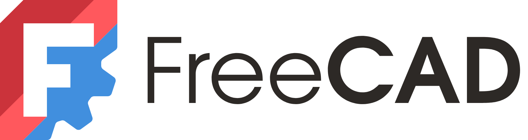
The first row is the new logo that will be used going forward and in version 1.0 of the program!
The contest from last month had established five finalists:
The first row is the new logo that will be used going forward and in version 1.0 of the program!
They already settled with the first logo form the image. They use it on their site and on their Mastodon presence already.
From the available finalists this is the best logo in my opinion. It is recognizable in various sizes, in black and white, as outline, as silhouette, and looks different from the previous one but not wildly different, so the established CI stays intact.
They should update the lemmy community too…
Done. It should take a while to propagate to every instance.
Keep in mind tho, this is an unofficial community.