Attached: 1 image
Found it! (Thanks @largess@mastodon.au)
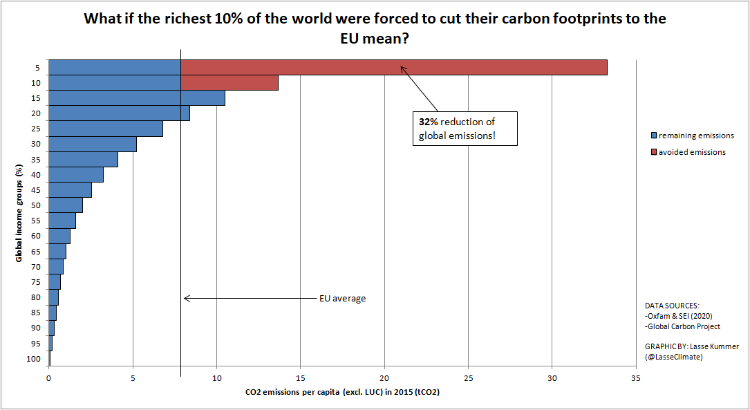
If the world's richest 10% reduced their carbon footprint to the EU mean, carbon emissions would fall by 32%.
Am I reading the graphs right if I see the main problem being private yachts and flying? Ofc cars are also included in the transport emissions, but unless they make up the majority of the emissions, the effect of cutting out some of the flights would reduce emissions by a lot.
Seems like a reasonably easy problem to fix, if one was to implement some type of “carbon tax” that targeted at private boats and planes.
10% of the world is eight hundred million people, so it definitely can’t all be private jets and yachts. That’s the entire population of the EU and US added together. That’s not to suggest that yachts or private planes should be off the hook, of course, as the previous chart does show that they’re utterly awful. It just means that there’s too many people included in “10% of the world” for it to be the only part
I agree. That just something that stood out to me about the graphs. The majority of the emissions of the very richest people seem to be from luxury type of travel.
Cars do make up a huge part of transport emissions. Passenger road emissions count for 45% of transport emissions, all air traffic including freight only 12%.
No, because the sources of the emission are not included in the graphs. The graph itself shows nothing about yachts or private planes. However, I get your point and am very interested to see a more detailed breakdown of the sources of emission at each level.
I should have probably specified which graph I was referrign to. The top of the page has a graph of billionare emissions, which are mostly from private planes and yachts. Those probably don’t make a significant share of global emissions due to there being few billionares. That does however account for most of their emissions, which are already much larger than average.