

Hi, mostly small improvements in this release. I spent a bunch of time on a horizontal swipe to go to the next post but it still needs some work. Anyways if you want to check it out it’s under an Experimental tag at the bottom of settings. If you use List view I hope you like this release as I made some improvements to the List view layouts.
What’s new
- General font size adjustments
- Comment replies are now selectable when replying
- Added Reset buttons to all colour pickers
- Blocked instance comments now have an optional message to show them
- Improved the ‘Show more comments’ button in some scenarios. Should show on Profile views now too if there are responses.
- Moved the instance name down from the title as it was getting cut off in same cases
- Added user tag options to comments and posts action menus
- Experimental feature horizontal swipe for next post
- Improved the UX of the list views
- Added ‘Copy URL’ to image views
Fixes
- Fixed theme surface and background not resetting
- Fixed an issue where saving settings would override theme customizations in some scenarios
- added option to block instances via post options menu
- Now only one comment can be active at a time, clicking another comment will deselect the previous one
- Changed user tags to use the tertiary comment, should be more obvious now
- Clicking the + button to create a post in a community should now autofill that community.
- Fixed a bug where the reply button wouldn’t work if swipe navigation was turned off.
Question: would you prefer to see a bottom navigation drawer or top level comment navigation (^ prev v next) in the next release?
Links:
-kuroneko

This is such a nice app, better than reddit app from day 1.
Thank you for your work !

Some Stuff I found with the 72 version:
- the number counter inside the bell icon is not centred
- The thumbnail preview is now centred not at the top, which moves the text in the post to the right as well
- if I wanted to use the commentbar, I have to click perfectly on the comment text, nothing happens if I click on the comment box
- Color picker, I do not know which of them is already chosen. It only Highlights when choose a new one. Additionally it would be nice if we could see where we choose it by the circle colors
Settings:
- Why is the “Limit Thumbnails height” not down by the other activating settings?
- the text for “Show Post Bottom bar” is not correct - it should be “Affects all Posts”
- the next is we are getting thankfully more and more features, and with all the features we are getting settings to activate them so it’s getting crowded down there. My Suggestion is to make own menus for them if this not possible sort them together, we have them a bit all over the place right now (swipe settings as an example)

I’m enjoying this app.
Thank you so much for this app. From all apps I’ve tested this is by far the best!
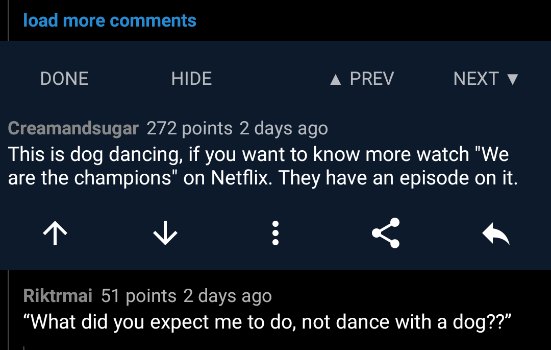 Top level comment navigation would be great. Here’s how it was done in Rif. As you press next it will scroll to next comment so that it’s aligned with the buttons of the previous comment --> buttons stay in the same place.
You can also see the high information density in the picture. You can have many actions in a tiny comment box if everything is tightly packed.
Yay for the user tag fix :)
I’d like to hide the community pictures in list view, I’ve never liked those or avatars as it ruins the uniformity. That said, good update and great app! This is my main Lemmy app now.
Did ‘hold to collapse’ used to work on the white space to the right of a comment title? It seems to require holding over some text now.
Thanks a lot
For the last question, I vote for prev/next button