


I don’t think there ever can be a better icon. Some are experimenting with a down-arrow pointing to a flat surface, but the floppy fisk is much better.
Thats downloading clearly. Which could be synonymous with saving of course in some way.

Every time you download, you are saving. But not every time you save, are you downloading.

Probably the closest one is an open HDD but still. Good UI should not require explanation and everyone recognises a floppy disk as “Save”.
Same as if I want to send domething and see a paper airplane.
An HDD is also a deprecated symbol
Agreed but given the symbol for an SSD would be a rectangle or a rectangle with a plug at the bottom, I think HDD would be the most recent tech that would convey “save” when used as a symbol.
Hard to beat the good ol’ floppy though
💾
There is an icon that Adobe has with an arrow pointing down into a folder, and I think that works pretty well.

It’s become a symbol that has meaning even if the physical object isn’t used or doesn’t exist any more.
This ⏳ is a symbol that means “time passing” even though the object is rare and obsolete. This ⚽️ is a rare type of soccer ball/football, but it’s the most recognized symbol for the game. This 🚕 isn’t what taxis look like in most places — and many people have never used a taxi; they take Uber.
You know the hourglass was a good lead but then you went overboard.
That football look isn’t all that rare, maybe in the US? Same for Uber, I have never taken one and they are definitely not the only “new taxi”. Again, maybe in the US this is more the case than anywhere else.
I’ve never seen a soccer ball that doesn’t look like that, as someone in the US. What else would a soccer ball look like?
For example in US soccer the balls look like this: https://www.adidas.com/us/mls-balls
You sometimes might see the black and white ball but it’s a retro/novelty thing.
what in the Minor in Graphic Design are those…
The basic shape of pentagons and hexagons is almost always the same, but the black-white color combo is pretty rare - the balls are usually white with colorful designs and use paited shapes other than the ‘basic’ petagons and hexagons.
For example, take the soccer wikipedia page The image on the side shows a ball with a design that looks like the emoji well enough at a glance, but you’ll see it’s quite different. If you go on the wikipedia list page for FIFA World Cup balls you’ll see that the ‘Tango’ style lasted for 6 competitions while the ‘Telstar’ (the one in the emoji) lasted only 2. After 2000 the designs got really wild and nothing like the Telstar. And that’s just looking at FIFA World Cups, ignoring all other competitions and events, as well as balls you could buy at a store
If you were to go look at the balls in a sports shop with some 5-6 models of soccer balls, sure, you’ll most likely find a ball that matches the Telstar aesthethic more or less closely, but there will be a lot of variation in the designs that are nothing like the Telstar, as opposed to balls for other sports which are much more standardized.
I guess I was stretching it. In my defense I have never seen the black-and-white ball in play at kids’ or professional matches. And there aren’t yellow taxis in my city. Yes — in the US.

The ⏳ is still the most intuitive way to represent “time passing” with a static image. One could maybe use a ⏱️ with the needle blurred to indicate movement… but the beauty of ⏳ is that it needs nothing more, just like ⌛ clearly indicates “the allotted time has passed”.
As it should
Preach brother! Preach the truth to these heretics who doesn’t even talk about phone icon in their phones is still from the analog days.

The digital age phone icon is just —

/jk
So? We still talk about people being ‘three sheets to the wind’ or hanging on to the bitter end.’

‘toeing the line’, ‘swinging the lead’, ‘letting the cat out of the bag’ etc.
Optimistic of you, that we will get our shit together and get there. Can’t even mask to save millions…
I think it’ll happen the other way around. Will get out there at least in some amount because the materials out there and we can mine them. There will be plenty of opportunity in space for people to form their own societies. They’ll have to it’ll be too difficult to administer from earth not unless we invent faster than light travel and then you’ll just do the same thing on a larger scale.
The problem earth has is there’s not enough room for everyone to experiment with different societies.
With more room we have more people and with more people we have more innovation eventually someone will invent the replicator or matter synthesis or something and we can stop worrying about resources at which point governments rather cease to have any power.
I’ve used a Zip disk more recently than I’ve used a manila folder, but we still use those for directory icons (and the Open icon).
The click of death will come for them eventually :p
As it should be. We no longer use floppies so it can exist purely as its own icon and not be confused

It’s the year 2023 and people are still using “X” to represent the number ten.
And “A” to represent the wide open mouth vowel … and …. You get the point.
I wonder what the oldest symbols still in use are? You could probably argue for some of the old language roots for say water that arguably as far back as language itself.

Speaking of water… How often do you actually see a drop of water shaped like a drop? Almost never
Every time it sticks to a vertical surface, like on glass: 💧
This on the other hand, is not how drops fall: ☔
2246 is wayyyy to soon to have Mars Terraformed
Eh, depends on if the singularity hurries tf up.
It’s 2023, we haven’t even gone back to the Moon…

That’s download.
Download is supposed to be:

But what about this one:
With most apps auto-saving nowadays, even Win11’s notepad, it seems like a “prevent my work from disappearing” is becoming an obsolete icon.
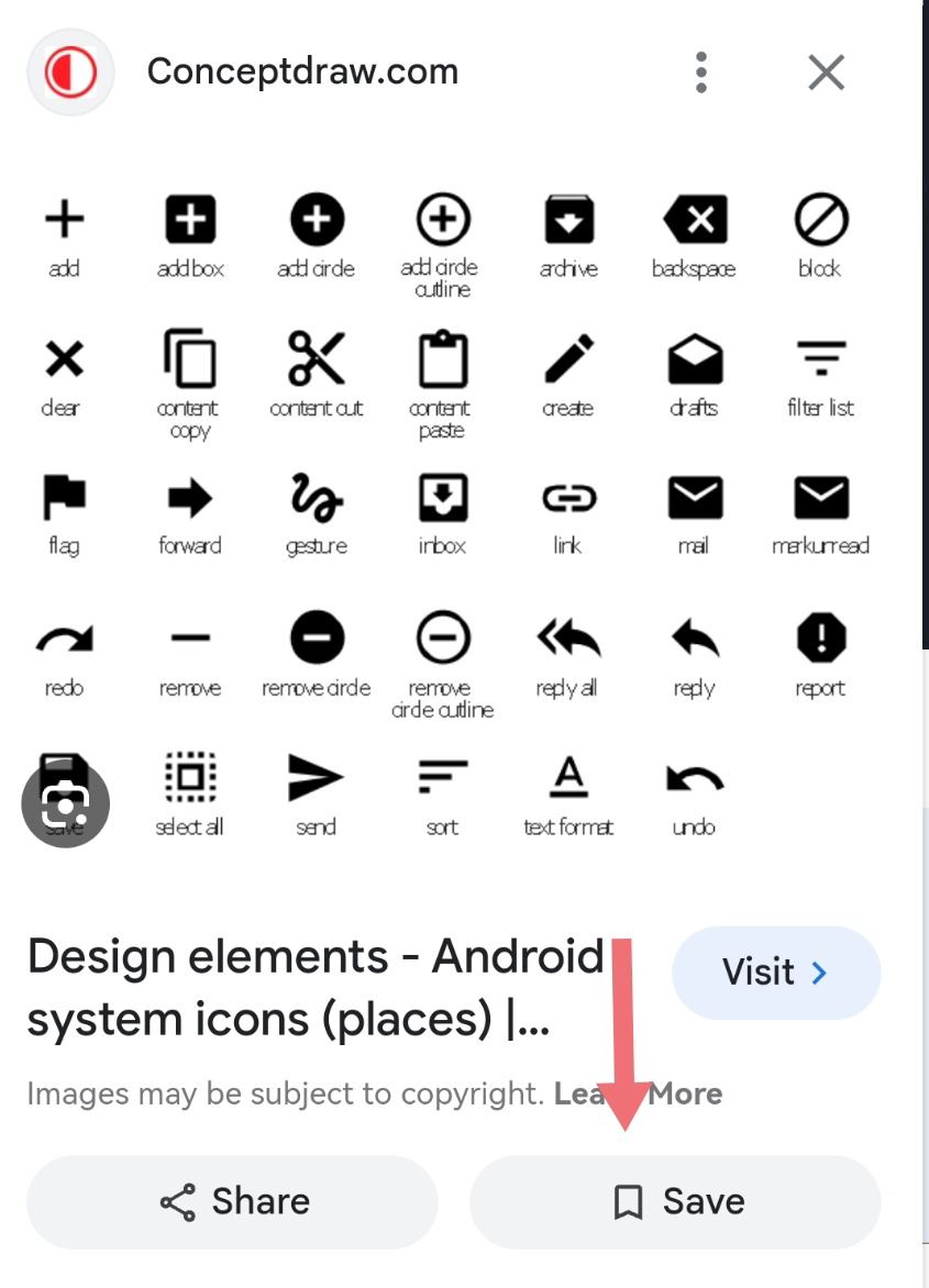
That’s a bookmark. Specifically, it’s a skeuomorph of the ribbon some books come with sewn into their binding for marking a page.
a skeuomorph of the ribbon some books come with
And yet, it says “save” right there on the button.
Don’t miss the larger point: “save” no longer means what “save to a floppy” used to mean. For a lot of people, “save” means to download, or to bookmark, while apps do the old “keep app data for later” by themselves in the background.
…and it isn’t 2246.
The image is of a website and the context is “save your place”, which is why it’s a bookmark icon: that button creates a bookmark that loads that page back up. The context here never meant “save to a floppy”.
It’s 2023, there is no context anymore for “save to a floppy”. As for the “Save” like in the meme, the contexts we have left nowadays are: “save your place”, “save to your device”, “export”, and little more. In fact the “Share” icon could replace them all, with “Share” on mobile showing, among others, options like “share with the cloud app” or “share with the file explorer app”.
I think “save to local storage”, (be it a floppy, a HDD, a SDD or whatever NVS phones use) is a timeless context that isn’t going anywhere. Share, implies lending access to someone else, it is a completely different concept than save.
It used to be a piggy bank and peeps from many countries had no idea what that was supposed to be…
The QWERTY keyboard layout, developed for typewriters in the 1870s, remains the de facto standard for English-language computer keyboards.
We also still “dial” phone numbers, despite the fact that phones haven’t had dials for something like half a century.
It only recently occurred to me the literal meaning of floppy vs. hard disk and the distinction between soft-, firm- and hardware.
I thought they were called floppy because of those old ones that were you know… Floppy, in difference to the hard disks inside the tower.

They were called floppy disks because, originally, they were literally floppy while the hard drive was, you know… Hard. 5 inch disks were flexible. 3.5 inch disks were not literally floppy, but still were called “floppy disks” given they were the same thing, but smaller and with more rigidity in the casing that held the magnetic film.
Wait until you hear why Bill Gates called the company “Micro-soft”…
Gates didn’t name it AFAIK. From wikipedia: “Allen came up with the original name of Micro-Soft, a portmanteau of microcomputer and software. Hyphenated in its early incarnations,”
Guess I’ll have to tell it…
After Bill and Melinda Gates have their honeymoon, Melinda turns and says, “Now I know why you call it Micro-Soft”.
🥁🛎️
Ah, just a bad dick joke. Got ya.