

I really hope you can turn this off
Indeed. I get there are people who probably like this feature, but not me.
I’m tired of Mozilla pushing UI changes on people just for the sake of “progress”.
…especially when they don’t bother to fix years (sometimes decades) old bugs.
why? It’s objectively better?
it also shows the url of the page, super convinientIt’s objectively worse. Fancier but objectively worse.
Another big, distracting pop-up that has no benefit over the existing tool tip which is still distracting when it pops up unintentionally. Also the preview will use more system resources.
It’s objectively worse. Fancier but objectively worse.
It isn’t though, Firefox stock tab management is awful, when you pile up a decent number of tabs you can’t even see the name of the tab properly, this happens in all the browsers ofc, but at least you can have more tabs opened without this being an obstacle.
You really need 3rd party add-ons to manage your tabs with Firefox, unlike in Chrome, Vivaldi, or even Safari.
With this feature at least you can have a quick look at your tabs easily, just like with the aforementioned browsers… Now I really hope they could add a button like Safari where you can see all your tabs too…
your gpu is actually much slower at text rendering than rendering images
It’s not objectively better or worse. Some people will prefer it and some people won’t.
Not objectively worse or objectively better, but subjectively worse.
Here I’m still waiting for an official vertical tabs feature.
This is not even close to the worst thing they have ever done, but stuff like this is a waste of resources. People mostly want official vertical tabs and more than anything engine performance improvements. (and the ability to pretend to be Chrome in Youtube)
engine performance improvements
Absolutely. Firefox is so slow compared to Chrome. Switching tabs, scrolling, video calls, … sure. Sure, Chrome/Chromium is a memory hog, but come on Mozilla, just invest in Servo already and stop adding useless features.
Firefox desktop performance is on par with Chromium. Also Servo is now a project under the Linux Foundation, and likely Mozilla Corp doesn’t have enough employees to contribute to external projects.
Firefox desktop performance is on par with Chromium.
Mate, I don’t know what kind of beast or toaster you have as a machine, but my experience tells me otherwise.
Also Servo is now a project under the Linux Foundation, and likely Mozilla Corp doesn’t have enough employees to contribute to external projects.
Yes, Mozilla fired the entire Servo team and gave their previous CEO a raise during the pandemic. They can still pivot and focus on Firefox instead of whatever other stuff they have been doing.
Same. Install Firefox on a ChromeBook, which are almost all universally low powered, then watch it chug.
I don’t care how long the former CEO has been involved with the foundation, she has not been good for Mozilla.
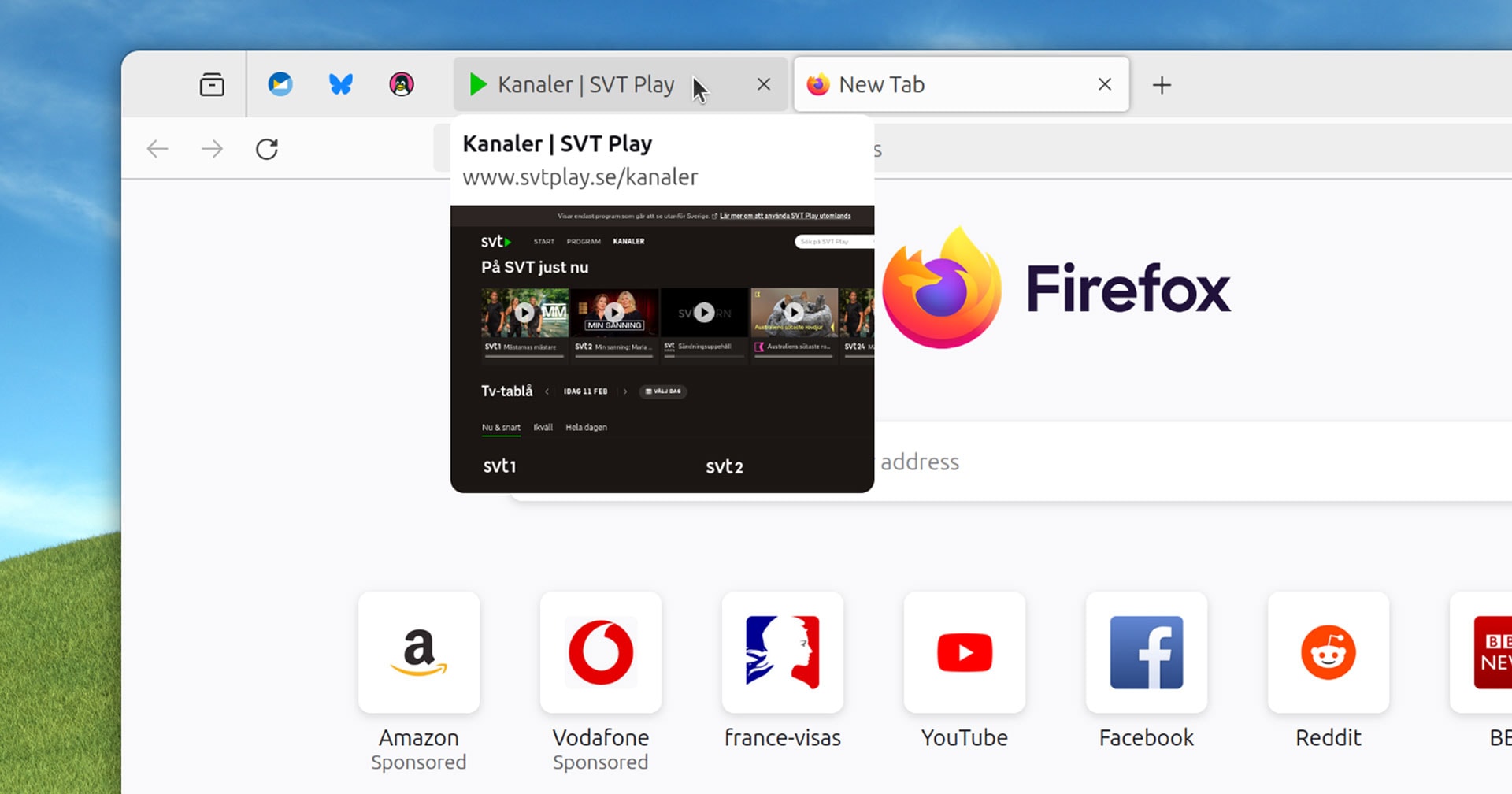
In current versions of Firefox you hover your mouse over a non-active tab […] to see (after a small delay) a tooltip containing the web page title.
Uh… what is the point of that? If I am looking for a specific tab then:
- I probably want to switch to the tab that I am looking for, so staying on the current one is not required
- if there are a few tabs from different pages from the same domain the difference might be hard to see on a thumbnail (similar page headings with logos)
- and most importantly: opening the tab is faster than waiting for the delay anyway
This sounds like a “cool” feature that’s looking for an actual problem to solve.
Tooltips are a standard accessibility feature. Just because you may not find them helpful doesn’t mean others do not benefit. The delay is to ensure they don’t get in the way unintentionally (but still allow usage) for those who do not need the accessibility benefit at all times.
In the vast overwhelming amount of cases tooltips show additional information that you cannot see from clicking on something or provide an explanation to an option that isn’t available without scrounging through a manual. None of those apply here.
Tooltips show the full title of the tab, which is useful if the title is long, the tabs are small because there are a lot of them, or it’s a pinned tab
The page title isn’t necessarily visible on the web page that sets the title.
Clicking is not always a simple task.
I shouldn’t have to leave my current page just to figure out what another tab is.
Again, just because you feel something is useless or easily avoided doesn’t mean that all internet users feel the same.
So, a toggle in accessibility settings, default off?
Wait, FF doesn’t have separate accessibility settings anymore?
I think many people in the comments suffer from some version of curse of knowledge.
Sure, this feature us quite irrelevant for a power user who is quick to navigate the browser and needs a split second to remember what tab it is simply by reading the header and seeing the icon.
However, many less proficient people can benefit from this feature. Not once I saw how someone who has 10 tabs open and needs to go to a different webpage, starts meticulously clicking through every single one of them because they have no idea how the page they are looking for is called, they are too overwhelmed by using web as a whole to take notice.
Power users love to bash accessibility features like this. Its a classic case of “I don’t need a wheelchair ramp so i dont know why the library added one!”
Accessibility is way more than screen readers. It’s more than specific disability-minded modes. The web needs to be friendly to everyone, including people who may not know they could benefit from accessibility features. Everyone benefits from this type of work.
There are definitely some legit feature concerns and priorities being called out here. Mozilla has left a lot to be desired of late on that front. But a power user is more than capable of jumping into settings or about:config to turn things like this off, or finding an extension to get by for now.
Also the firefox dev team isn’t tiny. This isn’t blocking other work or anything in a substantial way, it’s a fairly isolated piece of UI, and there’s no guarantee that skipping this would change the timeline on anything else.
How is hovering over a tab and waiting for a preview faster than clicking it?
Again, in my opinion you approach the problem like a power user. Using a browser is not a speedrun where every millisecond matters. Here is why I think it provides more comfort to an average user:
- No need to divert attention and look around the monitor. When you’re not well versed with a mouse, it’s easier to click and look at the same place
- Nothing distracts you unlike when you click through pages. Imagine going from dark theme page to a light theme page, the entire screen suddenly lights up
- Depending on the way it is implemented (perhaps by keeping compressed page screenshots?), it might be faster to show a preview than to render the page again on a weak machine
I’m not sure how clicking can be considered “power user”… Had I said “just install tree style tabs, it’s much better”, you might’ve had a point, but you’re arguing that clicking is worse than hovering. Really can’t agree with you.
But hey, I don’t give money to Mozilla and the chance is very low that I ever will, so they can do what they want. If they think this is how they want to spend the 500 million they get from Google, that’s their prerogative.
I’m sorry, but did you… read my comment?
I didn’t say clicking is power user, I said that you assessing features in terms of speed (“Is hovering faster than clicking?”) is a power user approach. It’s deeper than just bare speed and accessibility features are not developed to provide physically faster experience, but one that is more comfortable for some group of users.
Hovering preview does not even take ability to click through tabs away, but could provide comfort for a user who is not as browser proficient, for the reasons I outlined above.
This is quite useful, especially for those sites without meaningful or distinctive names.
1000ms delay seems to be little too much to my liking, changed
browser.tabs.cardPreview.delayMsto 500 and it feels much better.Preview is pretty short for some reason, it might be related to my monitor (32:9) aspect ratio?
This was already a thing for ages until they killed it, but it is still possible if you are okay with tweaking userChrome.css
Why Mozilla wastes resources on their own implementation instead of providing API’s to third party developers is beyond me.
Your first link is based on XUL, which was deprecated because it was wasting resources being unmaintainable and insecure.
Here’s a great article about that
Admittedly, yes, XUL was a complete shitfest. Though I remember that it was more due to security patches and poor memory management that caused the apparent poor performance, not so much for addons. I was on waterfox classic at the time of writing of this article and had like 30 addons enabled, including TST, CRT, and TileTabs. all non-e10s-blocking, and, I assure you, it was just as fast(and slow) as quantum.
But, that’s besides the point. Customization, especially via addon’s, was one of the defining features of Firefox. Before, you had opera, which you could customize it within certain limits, Firefox if you want full control, and IE if you’re a dummy. Now, you have Vivaldi if you want customization within certain limits, Chrome if you’re a dummy, and Firefox is… just… not chrome? I’d say the addons should’ve been kept at all costs, maybe in a different way, without amputating the whole browser. But they did and it lost it’s appeal to a major portion of people. Of course there are still exclusive features like container tabs and min vid, but those are not exclusive to quantum either. The whole ordeal sounds just like that time when Yandex, in order to solve a support ticket overflow, just removed the contact support button.
This person said XUL is insecure! Any Palemoon users here? Anyone wanting to tell them that Mozilla is totally taking away user Freedom and that Palemoon is a totally secure Browser? XD
Shhh, they’ll hear you
Nice! I remember using an extension for that back in the day
Actually I was going to look up such an extension, but then I read this news (some days ago here… This is Lemmy after all…) But then I’d rather wait for the official implementation.
“We’re super excited to announce that we’re working on a feature that has been requested by no one ever”.
Not a bad feature IMO…
Chrome has it for some reason so I guess they’re just copying them
being chrome but slightly worse at some things and slightly better at other things certainly sounds like a winning move…
It’s a stay-in-the-competition one. While I would love to see a ground breaking change soon, Mozilla surely can’t do that in every update.
they’re already out of the competition, let’s not pretend that firefox has any significant amount of marketshare
I requested it
deleted by creator
This is a useless feature. Here are some purely UI features that are more important, and exist in Chromium:
- more compact hight, saving space (make
browser.compactmode.showofficial!) - CSD decorations (_ 🔳 x) in the top right, hitbox at the very edge, f**k GNOME for this
- Tab groups natively in the Tab bar, its the most organic
Apart from that Firefoxes UI is way better than Chromiums and doesnt need to copy anything.
Then work on performance, process isolation etc.
> more compact tab bar, saving space
Not sure if you’re aware, but there’s a hidden setting to make Firefox’s toolbars more compact:
https://support.mozilla.org/en-US/kb/compact-mode-workaround-firefoxCool, will try that!
I still use this one:
As I said somewhere else, to get more compact tabs you can go to about:config and search for a setting called
browser.tabs.tabMinWidth, I usually change the number to 20 (the default minimum width is like 70) and tabs are allowed to become roughly as narrow as in chrome. And if by “more compact tab bar” you meant how tall tabs are, there’s thebrowser.compactmode.showsetting, put it to “true” and then in the Firefox menu under More Tools → Customize Toolbars you can select “compact mode” in the “Density” menu on the bottom, which makes the tab bar and toolbars shorterNo I meant vertical hight. The horizontal width is way better than in Chromium, same with the “scroll tab feature” which works well better.
That second setting
is betais no longer supported so its not shownBeta? It isn’t experimental, it was an official feature that is no longer supported (even if it still works perfectly).
Oh thats even worse haha.
- more compact hight, saving space (make
I don’t see the point personally but I enabled it just because and while it does work it’s currently very slow for me. It takes around 1 sec for the preview to appear so finding something by moving the cursor quickly across the tabs is impossible unless you slow way down.
From the article:
To control how fast/slow tooltips appear modify
browser.tabs.cardPreview.delayMs. This is set to 1000 (milliseconds) by default, meaning tooltips only appear once you’ve hovered over a tab for at least a second.I saw that later, I guess I forgot to save the edit.
150 ms feels alright.
Yeah I always turn off that previi crap immediately as it usually gets in my way of doing things. Please don’t even spend time on this feature, I don’t really see the use
I want to view multiple tabs at once, in a split-page view where I can scroll on one tab, then mouse-over to another and start independently scrolling on that one. It’s probably the key feature I miss from Vivaldi. Is there some insurmountable obstacle in the engine that prevents implementation, or is it stubborn devs?
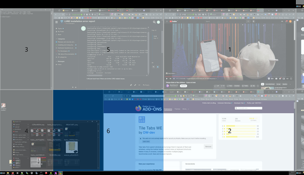
You can do this easily with Tile Tabs WE https://addons.mozilla.org/en-CA/firefox/addon/tile-tabs-we/ Works great, I’ve been using it for years
Example
You can also use FancyZone part of the opensource microsoft power toys
example
What I want is a better version of Tab Manager Plus in Own tab mode that can handle more than 1500 tabs and 30 windows without glitching as much


