

And no, I will not tell you what my company app is.

Wrong, the google product is dead
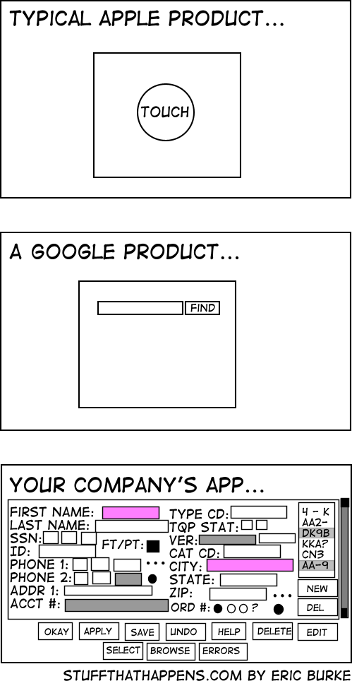
People at my company are like “why are we wasting screen real estate with white space?” and I imagine they see the last image is an ideal UX
We’re currently trying to convince our client, that 4 different levels “mandatory” fields in a form are about two too many.
The UI they sketched looks like shit, but they think it’s absolutely necessary.

But there was this one customer, where it was so helpful to know he’s left handed. So now this is a necessary information /s
And then the logging shows that nobody uses half the fields, but the business won’t let you remove any.
For the first two you need hoops and tricks for it to do what you want, the last one has bad UX. I choose the later.
I would argue that the first two require you to jump through hoops for edge cases, while the last one requires you to jump through hoops for every case.

Without knowing what the user is actually doing, that’s impossible to know. If the user has to input all those fields on a regular basis, then that one screen is the superior UX.
You’re right, but:
I beginner friendly UX is a safer bet. Besides, if a user has to manually enter all those fields (assuming it continues off screen) then that’s a job for a machine, not a human. Large data input jobs are dehumanizing.
Unless you’ve actually done the user research, you have no idea if a “beginner friendly UX is a safer bet” . It’s just a guess. Sometimes it’s a good guess. Sometimes it’s not. The correct answer is always “it depends”.
Hell, whether or not a form full of fields is or isn’t “beginner” friendly is even debatable given the world “beginner” is context-specific. Without knowing who that user is, their background, their training, and the work context, you have no way of knowing for sure. You just have a bunch of assumptions you’re making.
As for the rest, human data entry that cannot be automated is incredibly common, regardless of your personal feelings about it. If you’ve walked into a government office, healthcare setting, legal setting, etc, and had someone ask you a bunch of questions, you might be surprised to hear that the odds are very good that human was punching your answers into a computer.
There are more beginners then there are experts, so in the absence of research a beginner UI is a safer bet.
And yes, if you definite “beginner” to be someone with expert training and experience, then yes an expert UI would be better for that “beginner”. What a strange way to define “beginner” though.
There are more beginners then there are experts, so in the absence of research a beginner UI is a safer bet.
If you’re in the business of creating high quality UX, and you’re building a UI without even the most basic research–understanding your target user–you’ve already failed.
And yes, if you definite “beginner” to be someone with expert training and experience, then yes an expert UI would be better for that “beginner”. What a strange way to define “beginner” though.
If I’m building a product that’s targeting software developers, a “beginner” has a very different definition than if I’m targeting grade school children, and the UX considerations will be vastly different.
This is, like, first principles of product development stuff, here.

yeah. usability > UX
The last example has neither.
The flipside is that all of the stuff you actually use is buried five levels deep.
And the flip side of that is that the stuff you actually use is spread over 5 pages worth of scrolling and requires you to read like 100 labels until you find the text boxes you want
Apple/Google/Other Companies way, way over-do this. Clean, modern design is one thing, but avoiding all text, making things too small to see, and being unable to tell which option is highlighted, etc, all at the expense of the actual UX is such an annoying trend and I’ll never like it.
I’m a Millennial so of course I don’t have a lawn, but get off it anyway…
I don’t necessarily agree that they way overdo it, but I do agree those are all examples of bad UX design.
They’re right
Honestly, I’d rather have an ugly app with everything right there than the terrible UX trend that’s happening of everything being hidden behind 8-10 different menus just to make the home screen “clean”
It would be hilarious if all these apps were secretly just like vim. They all have complex hotkey setups that enable power users to get where they need to be in at most 3 key presses.
And the unititiated has to google to find where their god damn setting is actually located.
Honestly that would be great.
Very often they do. Many of these internal applications are from mainframe computer times when interacting with applications exclusively via the keyboard shortcuts was the norm. In most companies, they never dared to remove those because the Power Users are used to them for decades.
Problem is, few people are trained directly by those power users so they never learn those efficient shortcuts. And they are never well documented.
One of my favorite extensions is vimium. It enables vim like navigation on web browsers. If you press ? It brings up a menu showing all the key bindings, it’s very helpful. Adding that and a hotkey highlighter would be a good way to document such programs. It’s too bad that sort of thing isnt a priority
We’ve removed critical functionality from the operating system because our boss didn’t want more than 6 buttons on screen at any time. Sorry the system is 100x more difficult to use!
Yeah, or like having a separate screen for entering your username and one for entering your password …
If your company is implementing an app that is basically a toggle switch or power button, it’ll probably look like the first one. If your company is implementing an internal search engine, it’ll probably look like the second one. If anybody is implementing a data entry system meant to be used by trained individuals at a workstation, its gonna look like option three. You might as well complain about a CNC mill being more complicated than a screwdriver, they’re different tools.
That third screenshot, assuming good keyboard navigation, would likely be a godsend for anyone actually using it every day for regular data entry (well, okay, not without fixes–e.g. the SSN and telephone number split apart as separate text boxes is terrible).
This same mindset is what led Tesla to replace all their driver friendly indicators and controls with a giant shiny touchscreen that is an unmitigated disaster for actual usability.

There’s a difference between software that’s designed to be easy for people that haven’t seen it before and software that’s meant to be used by someone that’s been trained to use it.
Yes and no. I did build several in-house enterprise applications and for this I know about this problem. And yes you’re right, a lot of the complicated contexts are more complex than searching on Google.
But! Enterprise software architects have a tendency to make every feature as visible, and also making the apps as feature rich as possible. This comes with high costs.
I always try to establish a strive with exactly what google delivers.
Cage the user in his first decision, Filter or action and then show him or her the application with all the features feasible in the chosen context. It is amazing how complexity reduced most of these applications are when you just ask this first question.
I think it’s more a case of needing to be idiot proof and provide the correct answer every time. Some people using it may have been trained but they also may be absolutely useless at using technology. Google may be simple but it doesn’t give you exactly what you’re looking for and all the relevant information on the first attempt.
Please remind Microsoft of this as they continue to “improve and modernize” windows.
Can’t even use keyboard shortcuts to save a damn picture in paintbrush.
There is a clear difference here: the first software, you pay to use. The last one, you get paid to use it.
100% this. I used to work at a company that sold software that mechanical engineers used all day, every day in a certain field. Our app looked like the last pic but with better alignment.
People who are competent want all the things on their screen all at once all the time. They also want keyboard shortcuts.

An automation API would also be nice please… (i hope it doesn’t require an additional $4000/y licence)
The honestly prefer the bottom one than the modern 50 step wizards that take 10 seconds for each page to load, and load an ungodly amount of JS scripts.
A company I worked for was using an ancient bug tracking tool (called Pivotal) that looked like a 90s site. It was so fast and responsive. Later, we moved to something modern. It was 10 times worse, significantly slower and overly complex.
I hate when websites don’t have the username and password together. When you have to put in the username click ok then have some JavaScript hide the username prompt and prompt you for your password. Makes it more painful when trying to use a password manager. Especially one that isn’t built into the web browser by default.
KeePass autotype is amazing for these situations. Very customizable.
Not really relatable, but if i file something complicated i prefer seing all options to fill in the blanks if i’m not too sure if it’s the correct information for the question.
So i rule out some and find the best fits until hopefully most if not all is correct, getting asked one at a time means i have to get it right and if some better fit comes later i have to go back many steps.
Agreed. Everything on 1 page, submit, done. I had to use Workday at my last job and it was fucking atrocious trying to get anything submitted in because it was all step by step bullshit.

Ngl I prefer said company app rather than “new” stuff which runs on Electron and breaks just from looking at it
And you are asked to add more fields and buttons, but the interface was made in a very old version of visual studio and it breaks something every time you open it up in the editor.
Good.
You need all that information, but no more. This allows me to efficiently supply it, properly formatted, and to supply no more. Assuming this is using standard widgets instead of reinvented ones, the only better thing would be an API so we can roll our own form or automate.
The FAANG approach relies on an army of people to do the data entry equivalent of mind reading, or invasiveness, or both, and all so that you have to look at a few less boxes for a minute.
Your company’s app is SAP
Haha, no, cause then I’d be paid more.
Yay, options.
We have to get permission from Marketing, the CEO, the Pope, and the ghost of Queen Elizabeth 2 to change anything about the layout, so we just jamb in more buttons.
Ohh its easy. Its sap
Cries in Arriba guided Buying