
- cross-posted to:
- firefox@lemmy.ml


You must log in or register to comment.

L
o
o
k
sc
o
o
l
.UX is a very subjective matter.

A
C
A
T
I
S
F
I
N
E
,
T
O
O
What you are doing does not at all, besides not having to do anything with the topic at hand.
More like: Looks Cool
Versus how it is now: Looks cool
or if you have a shit ton of tabs open: lo… co…
Bad news is that it is not clear at this point whether Mozilla is going to go forward with the implementation. A post on Reddit by one of the project members suggests that the build is a “rough proof-of-concept”. Some features tested in the build “did not survive”. It is unclear which did not, as they are not mentioned. Mozilla is, however, implementing those that survived the cut into Firefox. Again, the poster does not mention which those are. It is also not verified that the poster is actually a member of the project team, so take this with a grain of salt as well.
Isn’t Firefox open source? So isn’t it possible that anyone could see the changes being made even in the nightly versions? I’m not a programmer so forgive my ignorance.

Those screenshots look really nice, ngl, hoping this goes through. Edge and Vivaldi have had their own vertical tab implementations for a while now, and there are Firefox forks that show it can be done. No reason for base Firefox not to have it at this point.
While I’m here, Mozilla bring back compact spacing, plz k thx.
Edit: Just tried it, it’s got that nightly jank but it’s promising. I hope Mozilla continues with this. It looks and feels great.

congratulats to the people liking them i guess. i personally dont get it, since most languages are written horizontally and i like ux to reflect this structure. such things are subjective though

since most languages are written horizontally and i like ux to reflect this structure. such things are subjective though
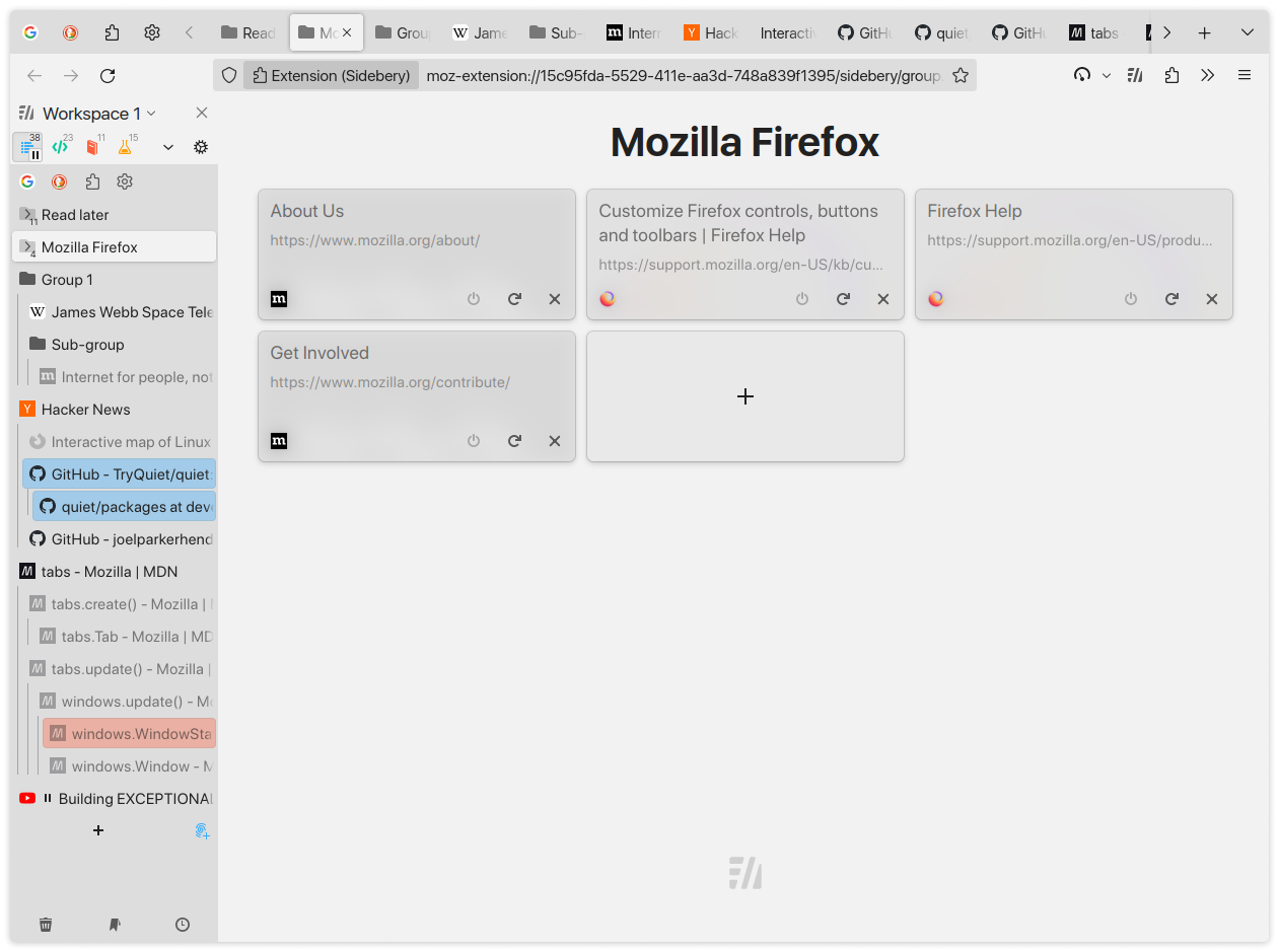
You might be misunderstanding what we mean by vertical tabs - we aren’t literally turning the tabs sideways and putting them on the side of the browser. We’re placing the tabs, still horizontal, into a stacked, scrollable list on the side of the browser. The superiority of this display method for tabs on widescreen displays is not subjective, and here’s why:
- Tab titles are not typically very long, but there tend to be a lot of them. This data is far more readable and accessible as a bulleted list than a long paragraph.
- Beyond about ten to fifteen tabs, tabs displayed at the top, side by side, must either shrink and obscure the title, go off-screen and be invisible without scrolling, or stack in multiple rows across the top. A vertical tab setup can easily display 30-40 of them in a vertical list, all with the maximum visible amount of their titles which helps distinguish them from one another.
- Modern desktop screens are wider than they are high, but webpage content scrolls vertically, often leaving a lot of empty space on the sides.
- Eyestrain is reduced and readability improves when the width of the reading area is reduced. This is why text on the web almost never fills the full width of a widescreen display, why most books are taller than they are wide, and why newsprint articles have many narrow columns rather than filling the entire page.
- Given points 3 and 4, tabs at the top of the browser window on a widescreen display leave slightly less room for the actual page contents, while tabs displayed in a vertical list on one side only cut into the white space that exists on the sides of the content, while keeping the titles readable and causing less eyestrain.
- With one change, a list can become an outline with sections and headers, following your own train of thought as you branch out and expand on each idea. In the same way, tabs displayed as a list can be very easily displayed with a tree structure, allowing tabs to be grouped, collapsed, and generally organized in ways that are impossible for traditional-style top-tabs.
This is why Tree Style Tabs exists, though I prefer Sidebery these days, being more customizable and performant than TST. There’s no way I can ever go back to top-tabs.
In a real life scenario that I can ad hoc reproduce here on my PC, only point 6 makes sense. With the others I can not agree when looking at my open tabs here.
Try out Tree Style Tabs for an hour. I’m curious how you’ll feel about it.
I’ve been using TST for years and while it can be a bit buggy at times I couldn’t imagine going back to the default tab system.
This is my main, but I struggle to find a good CSS theme that integrates with this instead of Sidebery.

anyone else feel like a lot of these firefox updates recently are just them implementing the most popular extensions from firefox 3.6?

Literally the only thing I wanted!! 💚
My dream would for this to at least have an option for collapsable tree-style tabs. That’s what I’m missing the most from the Edge implementation. Even “normal” vertical tabs struggle when you have over a hundred open tabs.
And to round out this story, here’s a photo that we think evokes the concept of “vertical”.
Which, ironically, is probably a better representation of horizontal. No one talks about finding a shelf in a bookshelf. They talk about finding a book, which are laid out horizontally.
I would love the option of keeping containers in vertical tabs with “page tabs” horizontal. For example; Facebook, Personal, Banking, Work, Incognito, etc containers along the left as vertical tabs, and each one has all the pages in tabs across the top. Vertical tabs only appear after you open more than one type of container.

I tried so hard to get used to vertical tabs, and failed miserably. I just can’t like them. Lol
Shit just got real
As usual, Mozilla doesn’t come up with new things. Only when Floorp and Waterfox start doing stuff do they think “Oh wait, people actually like that? Well, let’s kill an extension or fork!”.
Tree Style Tabs have existed for years. I guess it took them a while to wake up.
The very first version of Tree Style Tabs was published in… hmm…
2007
The shameful part is the fact that Edge-Chromium added a native tree style tabs feature over three years ago, and has been eating Firefox’s lunch. Vivaldi has had native vertical tabs for eight years! Mozilla’s leadership is asleep at the wheel.
I just spent 3 days learning a basic level of css and messing around in my userchrome and NOW they decide to add it…
Your CSS knowledge is still useful to customise other areas of Firefox UI.

Useful … and mandatory!
Yesss come on! I moved to Edge at my place of work because I can no longer see what I’m doing with horizontal tabs. And we can’t use addons in Firefox.
This will land in ESR in three years time and then we’ll be rolling…
Why does everyone like vertical tabs? Today my tab icons are so small because I have so many. Monitors are wider than they are taller. What am I missing?
What you’re missing is that “vertical tabs” in this context isn’t talking about tabs literally turned on their side. We’re talking about tabs that are still horizontal, but instead of arranging the tabs along the top of the screen, and shrinking their width when there’s no room left, they’re given a fixed width and arranged in a vertical list on one side of the screen. The best implementations of this (such as Sidebery, which the previous screenshot is from) also allow tabs to be nested in a collapsible tree structure.
You sound like you’d really like the tree-style tabs offered by Sidebery on Firefox, or that’s built into Edge. Give it a try!
Just occurred to me, now I get it. That makes a lot of sense. I think I used to use some tree tab extension ages ago.
I won’t touch edge with a 10 foot pole. Data collecting, nagging, pos browser.
I’ve never heard of Sidebery before! I’ve been using Tree-Syle Tabs for ages now though. Why did you choose Sidebery for it?
It has better customization, better performance, and tab groups. I used TST for many years, switched to Sidebery only a few months ago. You can do stuff like set it to where tabs only activate on releasing the mouse, so you can rearrange unloaded tabs without activating them, or make it so middle clicking the tab close button unloads it instead. You can also rename tabs!
Finally got around to trying it, and yeah - this is much better! Thanks for the recommendation!
Monitors are wider than they are taller.
Personally, exactly for this reason.
Firefox has “minimum tab width” which takes care of exactly that and works perfectly. Unlike an “experimental” feature in some surveillance Browser by Google
They are awesome. To me at least, but only if you save space by hiding the regular tab bar and it is easier to manage tabs since they are now closer together. Also, if you make the right --or left, it is up to you, I pick right-- sidebar auto hide and letting just the icons show. You do gain a lot of extra space. Mind you, you need to enable CSS via About:Config. On too of, before, using say, Sideberry. I like you thought I did not like it but now that I have tried it. I simply will not go back. I have a userChrome.css file that place on all my machines on a fresh install, now.