


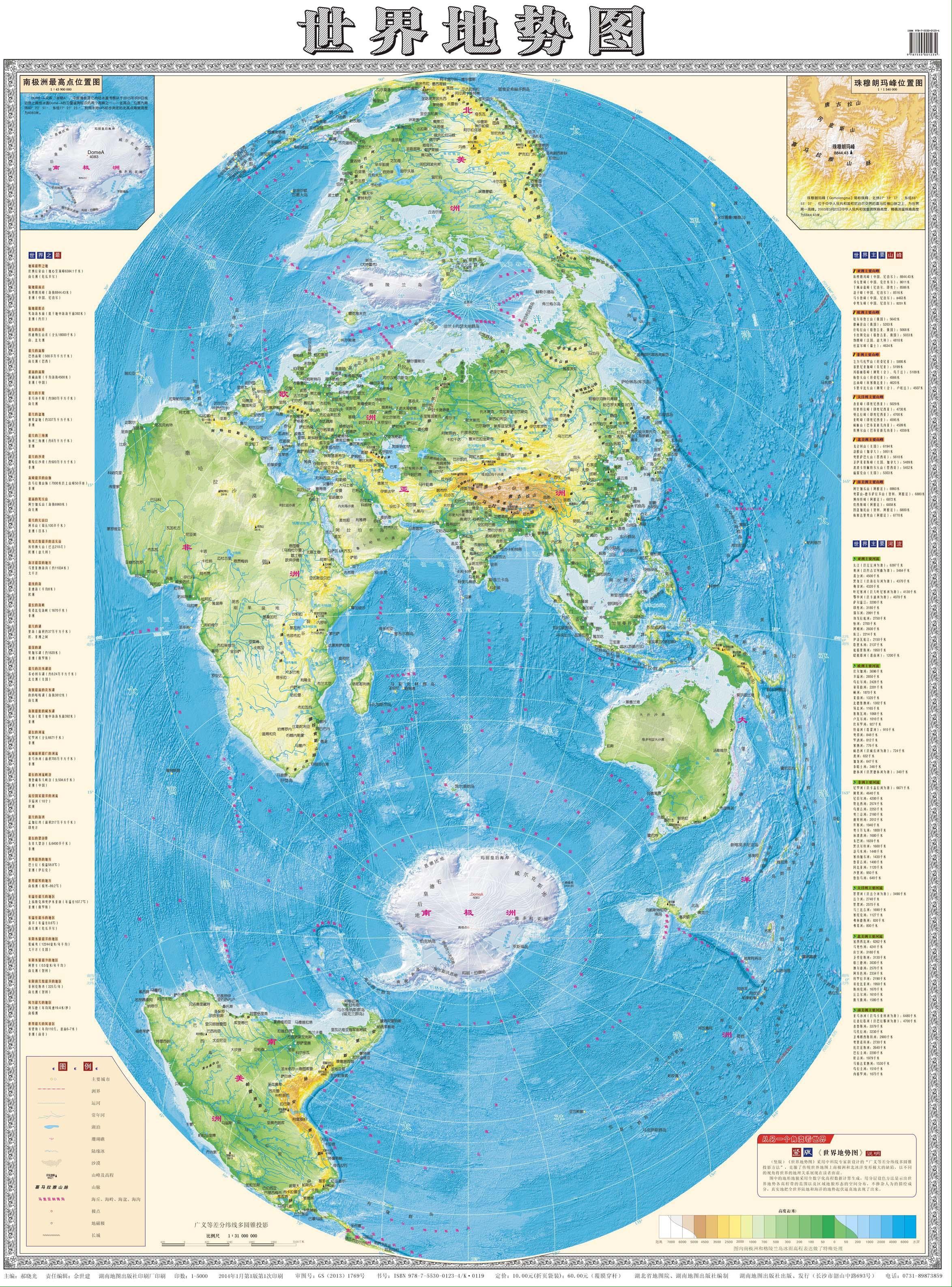
Seems like it’s very specifically chosen to preserve distances and reduce distortion along the longitude lines closest to China. Perhaps it is useful in that capacity but it introduces distortion for the entire rest of the world.
I guess it really puts the 中 in 中国 (中 means middle, 中国 means “middle country” and is the Chinese name of China)
https://feddit.org/comment/1079443
TY for highlighting the advantages of that projection.

Seems like this map accurately displays the poles at the expense of the continents
Looks quite similar to a Cassini projection with the 75° E meridian as centre instead of the 0° meridian.
Indeed, thanks!

but why tf is the equator not in the center
It is quite funny to see the US and the Americas generally kinda cast to the side in this map.
While it’s obviously putting China and Asia in the middle (actually looks like India is right in the middle) … as far as making certain areas look bigger or smaller than actually are, compared to the standard mercator style projections … Russia and Greenland seem to be the “losers” here while Africa looks relatively huge.
Africa is huge- many people underestimate it, although in this case it is a bit too large compared to India in the middle. Also the colorscale makes Sahara and other low desert areas too green - the habitable part is not so great.
Africa is huge
Oh I know … I noted it as a positive of the map … probably makes Africa feel appropriately big compared to the rest of the world.
Interesting, not a projection that I have seen before.
I love the one that shows Japan at the top very heavenly looking, and then the British Isles at the very bottom looking like the savage end of the world
Having been to both places… Yeah I understand.
Cries in anjin
this is gorgeous thank you so much for sharing it. so interesting. terrible projection for many reasons of course but fascinating for so many more
The way the map is layed out definitely makes it the hardest map I’ve ever tried to understand.
Don’t know why I zoomed in expecting to be able to read it
Good old “Zhonghua”.
Xianghua is a top 3 Soul Calibur character fosho
In case anyone is OOTL, that’s the Chinese word for China, and it can be translated as “middle kingdom” or similar, implying that they are literally in the center of the world.
It’s a way every culture tends to think about themselves, TBF.
Much like the Mediterranean.
5 insert currency says every china border on that map is wrong
This is not a political map
Wrong. It’s just literally all China. /s
Unable to view a quality version

I’m Chinese, I’ve never seen a map like this before. We usually just use Mercator but split along the Atlantic ocean instead of the Pacific. This map is just kinda bizzare. Why is Antarctica so prioritized? Why’s it in portrait orientation? I think it’s just intentionally weird, which is still cool.