- cross-posted to:
- linux@programming.dev
- cross-posted to:
- linux@programming.dev
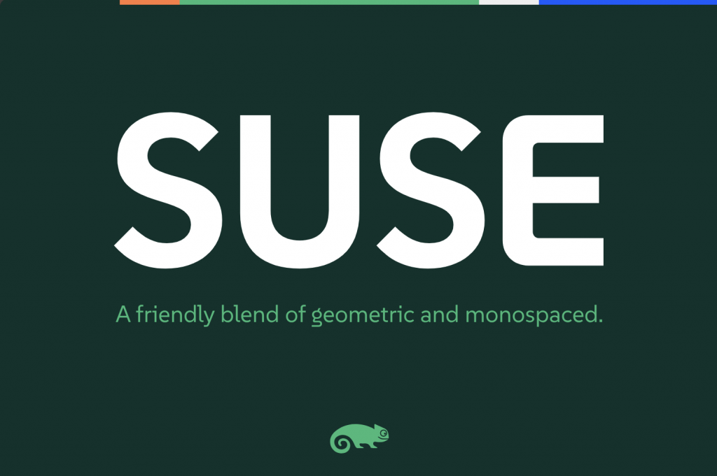
SUSE just open-sourced a typeface :)
You must log in or # to comment.
Already in the AUR as otf-suse and ttf-suse. :)
Silly question: what’s the difference between the otf and ttf fonts?
Edit: thanks for the explainers!
As far as I understand it, TTFs are more basic, while OTF can have more features and glyphs.
OTF is a modern extended version of TTF, with more features. Downsides are it can be bigger in filesize and could even take longer to load. But that is not really relevant for modern computing and one should default to OTF, unless there is a good reason to use TTF variant (if both are available).
Sounds like it, yeah.
https://en.wikipedia.org/wiki/TrueType
https://en.wikipedia.org/wiki/OpenType
no dotted zeroes = no terminal use
I don’t think this font was designed for the terminal. It’s a sans font with some inspiration from monospace styling, but with focus of brand recognition and usage in headlines or text. That’s what I’m getting here. Similar to what Ubuntu does with their font.
I need more discussion on typefaces. Typography is one of my hyperfixations. :-)
P.S.: I meant “special interests”, not hyperfixations.
I will give the font a try!
I’m not dyslexic, but I think legibility is super important and underrated on most distros. This one looks both aesthetic and very readable.
Do you know if it is already in the Fedora repos? If not, how can I install it?
Personally just grabbed it from their release page: https://github.com/SUSE/suse-font/releases/tag/v1.000. Then dropped those files into my ~/.fonts, directory.
This will be a nice addition to my collection of fonts :3
That’s awesome! Now how can I add it to Libreoffice?
It’s a nice font. I just have a hard time with trusting SUSE after the SUSE vs OpenSUSE debacle.
But does it have unicode emojis?
😀 😁 😂 😃 😄 😅 😆 😇 😈 🕧 🕯️ 🕰️ 🕳️ 🕴️ 🕵️ 🕶️ 🕷️ 🕸️ 🕹️ 🕺 🖇️ 🖊️ 🖋️ 🖌️ 🖍️ 🖐️ 🖕 🖖 🖤 🖥️ 🖨️ 🖱️ 🖲️ 🖼️ 🗂️ 🗃️ 🗄️ 🗑️ 🗒️ 🗓️ 🗜️ 🗝️ 🗞️ 🗡️ 🗣️ 🗨️ 🗯️ 🗳️ 🗺️ 🗻 🗼 🗽 🗾 🗿
Hmm it specifically seems to be missing emojis
It’s a latin font.
Designing all unicode characters would be madness.
Thanks. I imagine most unicode characters and emojis are just copied over from some default font?
Maybe they’ll patch it into a https://www.nerdfonts.com
I’m not a fan of the way the lowercase L’s tail interacts with uppercase letters, but other than that it’s not bad!
That’s a pretty good looking font. I think that lowercase g might be distracting but it’s workable.
The correct term would be typeface ☝️🤓
I don’t love it, but I also went in hoping for a possible new monospaced font to try out. It’s nice to have options and maybe give Suse a slightly more distinct look I suppose.
Try this: https://www.programmingfonts.org/
I’ve used it in the past, thanks for reminding me of it though.
Looks nice, but I will keep IBM Plex Mono.
i fw it
What does this means?
@P4ulin_Kbana @potentiallynotfelix fw = fuck with. It means they like it.
Thank you!
I think it is a beautiful font, but I feel like I can not read it as well as others fonts in my high DPI small font (or basically anything small) setup.
It looks gorgeous. Can’t wait to use it in my desktop.
Been using it myself since it launched, been loving it so far! Got it active on everything except my terminal.