


is this loss?
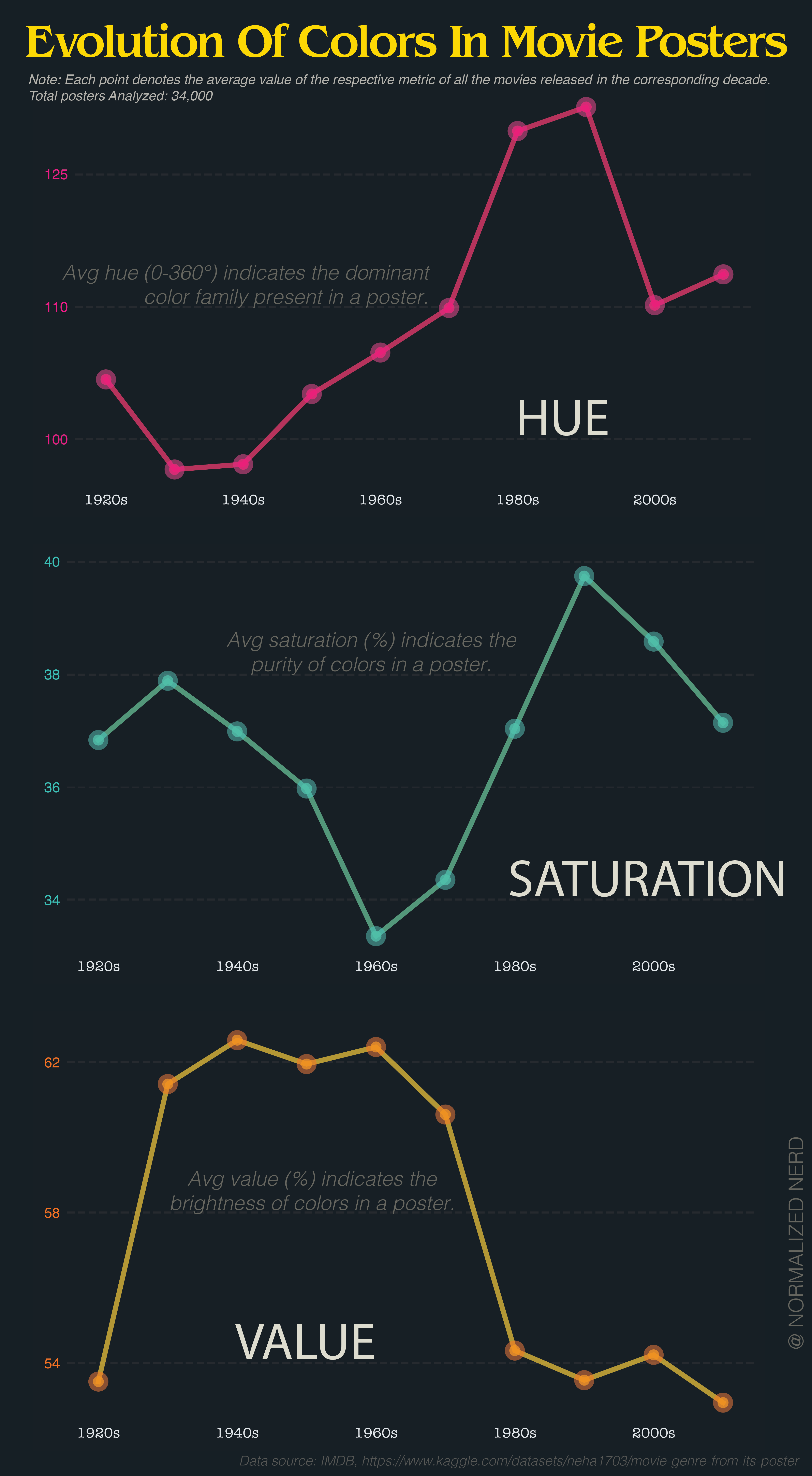
Be nice to have the y axis start at zero so we could get a realistic sense of the fluctuations.
Yes yes this is pedantic for a chart about movie posters, but we’re all pretty desensitised to disinformation; feels useful to train myself to recognise it & speak out about it. The y axis isn’t visible, so the chart is misleading 🤷♂️
The values changed so little compared to the full spectrum it wouldn’t make sense.
You’re not comparing to zero, but relative to values over time.
I agree with how it’s presented.
I’d love to see this for luminance. I know my vision is getting worse, but I cannot see the goddamn Batman or anything else made in the last five years
Value is essentially luminance.
I’d be nice to have a color legend next to the y-axis of hue
That’d be nice.
90 and 120 are rolling through the greens. Are posters mostly green? That seems odd to me.
The problem is that averaging hue makes no sense at all because hue is not a longest scale.
If you take a red poster (0) and a blue poster (240), it averages to green. Or take red (0) and red (359), averaging to cyan (180).
It would have made more sense if they had shown the distribution of hue as a polar graph and just had one every decade to show how it changes over time.

The average of 0° and 359° is obviously 359.5°.
it’s a radial scale.
I wouldn’t trust someone who tried to visualize hue like this to make that calculation correctly.
By that logic, the average of red and cyan is both purple and lime. Still useless.
Not if there is a clear trend. If most movie posters are blue, three average will be blue.
But i agree, it is useless if there is no clear trend.