
What fonts are you currently using on your system? Which do you think is best for the terminal or for your desktop environment?
(updates) Ok I think I’m a fan of Ubuntu nerd fonts right now
Inter for desktop and the nerd-font variant of JetBrainMono for Terminal.
+1 for Inter. Kind of reminds me of San Francisco :)
🟨 preview: Inter
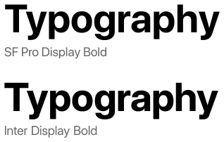
Lol I re-discovered Inter about 10 minutes ago, I find it a little better than Noto Sans. (edit) I’m not really sure, maybe I’ve gotten too used to the Notos.
I’ve been enjoying Fira Sans and Fira Mono for far too long: https://mozilla.github.io/Fira/
Please don’t hate me but for desktop I use Segoe UI. After years of using it everything else looks just kinda off and cheap to me. Similar to when folder icons are not yellow
Nothing wrong with that! I prefer Inter for nearly all UIs these days, but I still think Segoe UI looks better than GNOME’s current default of Cantarell.
I’ve been a fan of IBM Plex for a while now.
Sorry to judge them on this, but what an awful website!
The font is cool, though!
Ubuntu font. Idk why but I like it.
I agree! Nice memories of hitting backspace in a Linux Mint terminal and hearing that weird-ass BWOUP sound.
I recommend Ubuntu Mono for Termux users. Look at this black-background beauty – way better than the angly flat default
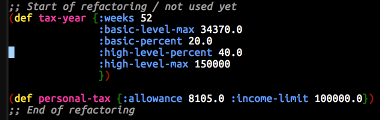
Since basically forever I use DejaVu Sans for UI elements and DejaVu Mono for the terminal.
me too, I loved Verdana before I discovered FOSS and DejaVu Sans is basically FOSS Verdana
I always use Dejavu sans mono for terminal and programming too. I think its the best in terms of readability where indentation is important
For desktop, I’ve liked Lato, Source Sans Pro, and Inter to name three.
For terminal, I used Iosevka’s customizer to create a gorgeous Fira Mono-like variant that I call Iosevka Firesque:
[buildPlans.IosevkaFiresque] family = "Iosevka Firesque" spacing = "term" serifs = "sans" noCvSs = true exportGlyphNames = false [buildPlans.IosevkaFiresque.variants] inherits = "ss05" [buildPlans.IosevkaFiresque.variants.design] capital-g = "toothless-corner-serifless-hooked" capital-q = "crossing-baseline" g = "single-storey-serifed" long-s = "bent-hook-tailed" cyrl-a = "single-storey-earless-corner-serifed" cyrl-ve = "standard-interrupted-serifless" cyrl-capital-ze = "unilateral-serifed" cyrl-ze = "unilateral-serifed" cyrl-capital-en = "top-left-bottom-right-serifed" cyrl-en = "top-left-bottom-right-serifed" cyrl-capital-er = "open-serifless" cyrl-er = "earless-corner-serifless" cyrl-capital-u = "cursive-flat-hook-serifless" cyrl-u = "curly-motion-serifed" cyrl-capital-e = "unilateral-bottom-serifed" cyrl-e = "unilateral-bottom-serifed" brace = "straight" ampersand = "upper-open" at = "threefold" cent = "open"Lexend Deca for me. A mix of a dyslexoc-font, Arial and a bit of the roundness of Comic Sans. (Sorry, probably bad examples, am no font nerd)
I read through the website, and it feels… odd.
Is this font’s only purpose to be variable-width tunable?
The website has this interesting showcase:
“[Student fluency] is measured in Words Correct Per Minute… Each student read out loud a passage set in a control of Times New Roman, then four of the Lexend Series — Deca, Exa, Giga, and Mega.”
They even give example text for the viewer in both fonts. Of course, Times New Roman was blown out of the water, and the viewer can feel it.
But… this is apples to oranges. Of course the viewer can feel it, Times New Roman is a freakin’ serif, and there are a quinquagintillion sans serifs for small digital text, for good reason! Then what does this font have over other sans fonts? I couldn’t find the “Stanford study” or any other comparisons, but if I were to surmise a guess:
“Variable font technology allows for continuous selection of the Lexend Series to find the specific setting for an individual student.”
It’s to be able to adapt for a student reader’s preferences.
I dunno, the site’s framing of “changing the way the world reads” feels disingenuous – it’s a nice sans tho.
Ok, I never dug so deep, I just really like the design, I did not know (or forgot) their ambicious/overblown claims
I’ve been using Source Code Pro for a while now. Might not be the best, but it does the job for me.
Personally, whatever is default.
I know that may sound weird, but I’m a huge fan of sane defaults that I don’t even notice are there.
Protomolecule for that scifi feel
Protomolecule everywhere? 0.o
Scifi fonts remind me of old Rainmeter configurations. Wonder if Rainmeter ricing is still around
🟨 preview: Protomolecule

Except the terminal and a few other places.
While it’s very good looking, it’s not extremely practical with no difference (almost) between lower case and upper case letters.
any with a dotted zero, extra points for italic.
Noto Sans for sans-serif text (and the OS)
It’s legible, standard-looking and support about every writing system in the world. You can install it on Debian using# apt install fonts-noto, some others like-cjkand-extrahelp with the “supports about every writing system in the world”-aspect.Merriweather for the serif font fallback for the browser, as well as TTRPG campaign printouts
It’s very legible, and looks quite sexy for a serif font. There’s no package for it currently (although AUR and Nix users might have better luck), it has to be downloaded from Google FontsJetBrains Mono for the terminal TUI’s
It looks a bit playful, like lego-letters, is legible and supports about every writing system in the world.# apt install fonts-jetbrains-mono.Although I use…
Verdana for source code
It differentiates every character well and leaves enough space to easily recognise special characters such as brackets. And I don’t believe monospace fonts are more legible. It’s included inttf-mscorefonts-installerbut the font is not open-source.I use M+ Fonts for most of my stuff.