
You must log in or # to comment.
Proud to live in the absolute lowest car-owning city. And I’m honestly surprised that it’s almost half! So few people who I know own cars. But there are big outer areas that are basically suburbs and I assume the ownership is higher there.
This doesn’t seem to discriminate between people who choose not to own a car and people who can’t afford to own a car.
The title could be cities with good vs bad city planning. All the green cities are designed to force people to use cars, because they made everything so spread out with little to no public transportation. The red cities are built properly with public transportation to help people get around.
Or bad vs worse city planning. I was surprised to see so many upstate NY cities on the low car ownership list. They do have some public transport but can still be pretty tough without a car. Though they’ve all had some efforts to rein in some failed urban renewal projects like bulldozing unnecessary freeways, and some attempts at improving walking and biking experiences.
I imagine that it has to do with the age of those cities. They were established before cars, so the older parts were designed to get around easier. At least that’s what I assume, because virtually all the cities with low car ownership are in New England.
Have you been to Los Angeles? It’s not so much that it was poorly designed as it is that it just never stopped growing. Los Angeles county is 4753 square miles.
Yeah, I went on a road trip a long time ago. I remember it was almost all highway with tons of cars without a good public transport system. They knew they were growing and could have held off the heavy traffic with commuter trains and a substantial public transport system.
Sure there’s a system already in place in LA, though I’m sure there’s room for improvement.
Here is an article by one of the cited sources covering a lot more cities. Was quite surprised to see Minneapolis at number 36 and Portland at number 45, as those areas are quite well known for having good cycling infrastructure in the US.
I live in a relatively small city in Europe and have not even wished I had a car the past 5 years. Trams, buses and trains take me to where I need to be. For everyday grocery shopping I can just walk 15 min.
Always plenty of talk about accessibility for people with disabilities and how we should be accommodating.
Yet people still default to red and green for fucking everything? Fuck the colorblind amiright?
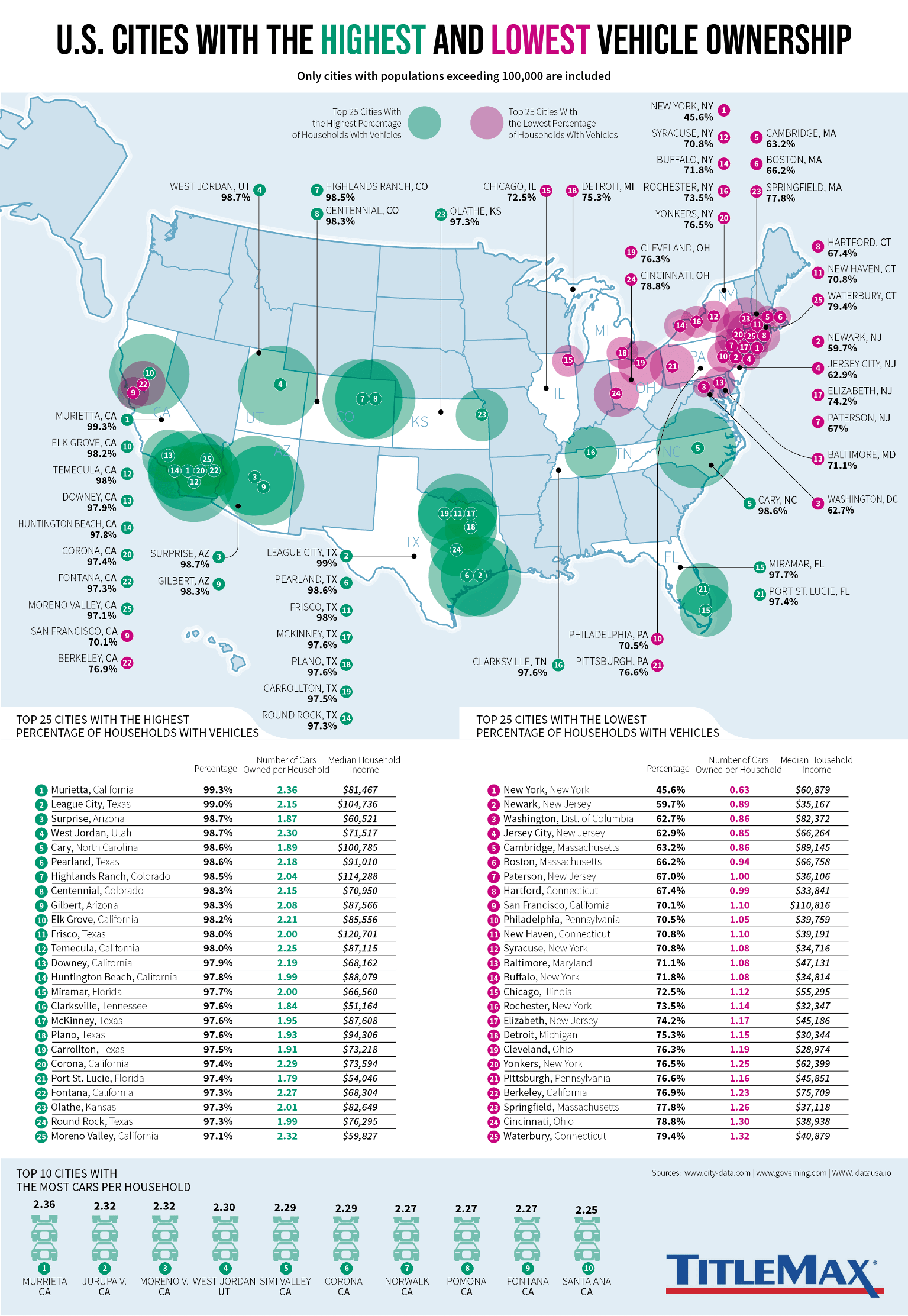
IE cities being in the top 25 is unsurprising but Murietta being #1 is wild. Totally makes sense tho if anyone has been in that area
Why is Detroit labeled as being in the UP?
It’s not. It took me a second to figure out, but there is a numbered dot with shading relative to ownership on the state. Then there is also a black dot with a line that labels it. For example, look at Cary, NC. I was confused because it looks like it’s labeled twice, but it’s just the way that the chart was designed. If you look at a state like Texas with more cities in the data, it makes sense that it makes it easier to name each of the cities from one point, but it can look confusing when a state only has one city in the data.
The city with the third highest percent of car ownership taking home less household income than the city with the lowest percent of car ownership is a surprise.
What a surprise
Im kind of shocked at some of the cities in the low vehicle ownership. Like for NYC I’m surprised it’s still as high as it is, and then other NY cities Im surprised managed to make the cut at all. Like buffalo syracuse and rochester do not have good public transit. Buses exist and Buffalo even has a single subway line that goes down mainstreet to downtown, but hot damn is it not a very reliable way to get around.
This is more a testament to poverty in those areas than anything else.
The most car household list is basically a not-poor list as well. They’re all not poor exurbs.
Buffalo is so much fun. Plus, their public transport is crappy, and Amtrak service is not as good as it should be.
League City is an interesting result. It’s a fairly small and partially rural area between Houston and Galveston surrounded by more developed areas. My first thought was that maybe the population is so small that it might throw off the numbers, but then I remembered it’s the location of the Texas Killing Fields where in the 70s and 80s there were a string of murders of young girls hitchhiking or otherwise getting rides from strangers on I-45 between Houston and Galveston. Maybe this has something to do with the 99% rate of car ownership? After a community goes through something like that… wouldn’t be surprising to me.
This isn’t surprising if you’ve ever been to these cities. It is almost impossible to exist without a car in the green areas, and it’s almost impossible to exist with a car in the purple cities…
Many many more cities could be green, but aren’t because people too poor to have a car live there. The green cities are not unique at all in there car needs only in their lack of poverty.


