Hi, thanks for all the great feedback on the last release. This release brings hide post functionality and improvements to the about instance page.
We also hit 20k active users! That’s an amazing milestone for only being live for about 2 weeks. I’m going to be working on a ‘New to Lemmy’ onboarding page as Connect is often the first place for new users. Also customization for swipe actions is high on my list to do.
What’s new
- Smoother swipe navigation on certain pages
- Fixed typo in Settings page (Affects -> Effects)
- Made scrolling up smoother in full width view
- Added ability to hide posts (it’s both the last swipe action and on the hamburger menu)
- Added a list of communities to the instance about pages
- Added user avatar to the drawer header
- Vibrate on comment collapse/uncollapse
Bugfixes
- Fixed a bug with getting next page is the entire first page is filtered
- Fixed a bug for users with >100 subscriptions
- Fixed a bug with sort values not taking effect -Changed the app name on the homescreen to just ‘Connect’
- Added a notification outside of drawer
- Fixed a bug where sometimes comment replies wouldn’t show the comment being replied to
- Addressing some logo feedback, I’ve removed the outer white ring
edit: 1.0.58 hotfix is waiting on Google Play approval now which fixes a couldnt_load_comment bug.
Links:
-kuroneko

Love the app so far…
I see that after today’s update the images are no longer being cropped, instead the full picture is displayed albeit small to fit the given space for each post.
Would it be possible to add an option to have the pictures displayed bigger? Right now it you are force to enter a post to see the picture properly. I get that for some it would mean a less clean look but set as a toggle option would be great.
Would also be great to let the Community name and user name be direct links, instead of now having to press the menu (3 dots) to navigate to the corresponding page.
An option for the top bar to not dispear when scrolling would be nice as well.
Also any thoughts on having a preview of how the settings affect post/comments?

Looks great but it’s broken. Can’t get content on comment pages.
Is that on a certain instance? I just tried it on a couple servers and it seems working

Seems everywhere to me. Page briefly displays before displaying “couldn’t get content”.

Having the same issue here. Can’t load comments from any instances I’ve tried. My home instance is lemm.ee if that matters.
Ok thanks! I’m rolling out a hotfix now (should be live in about 2 hours). I see lemm.ee is on API version 0.18.1-rc.4 so my suspicion is any instance on that version will have this issue. (The issue was that Connect was trying to load too many comments at one time, which was okay prior to today).

You the man! Super fast diagnosis and fix. Much appreciated 😁
Loving your app so far!

Thank you. Your app is looking fantastic.

You’re a gem! Thank you!
- Janis ( @Janis@feddit.de ) 3•1 year ago
i do not have or want a google account. what now?

Can you give us an option to load links into our default web browser
There’s an option in settings to always open links in the external browser, is that what you’re looking for?

What version has this? I’m not seeing this option in the android settings version.
Nm. I see toggle now. Thanks!

The new icon doesn’t seem to be adhering to the icon borders of the system on my Samsung phone.
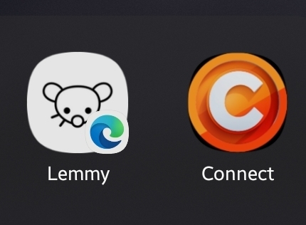
on my phone, all the icons are perfect circles so it is pretty neat. I guess the icon needs to have a transparent background for you?

Dev needs to provide an adaptive app icon.
please use the old connect logo, the new one gives me crypto vibes

New icon is super nice! I have Android 13 with round icons and it fits perfectly

I love the new layout and structure of the list views! Much more efficient use of vertical space.
However, I still wish I could view the domains of outgoing links of posts easily so I quit blindly clicking through to YouTube when I can’t watch a video, avoid poor quality blog spam, and junk like that. I checked for a setting or things like that but I didn’t see anything.

Any thoughts on why this community, specifically, won’t show up in my subscriptions? I’ve un/subscribed multiple times and it just won’t show in the sidebar. It did before the visible name changed away from the default, but at least in Connect it just won’t “stay” subscribed. The 3 dots menu will show it as subscribed, but if I close the app or navigate away from the community for a bit, it reverts back to wanting me to subscribe. Jerboa does show me as subscribed though, so I’m thinking it might be something with Connect in particular?
Also, potential suggestion, would it be useful for people to have a quick link to the official community within the app? Even if it was under some kind of help menu. Just an idea.

I’ve noticed a bug in this version. I tried to upload an image and realized I need to work on that.
The selections on the nav slider are hanging occasionally. They remain lit up rather than disappear. (Show a hover state)

[Bug, function]: For some reason when I turn on “Open links in external browser” it turns itself off automatically as soon as I save the settings.
[Bug, visual]: The three dots on the tip-right corner when opening a web page using the internal browser are white, on a white background. I had to guess there was something there.

Thanks for the updates!
It would be nice for the titles in fullwidth view to be above the images and link previews. That way the user gets the description of what they are looking at first.

I’m not sure if this is already on your list of things to do, but I’ve noticed the Inbox and Profile page (with all your posts) do not adhere to the posts and border styles that are set in settings.
It looks like the older interface and doesn’t have the sub-comment side colour borders either.


