

- cross-posted to:
- environnement@jlai.lu
- cross-posted to:
- environnement@jlai.lu
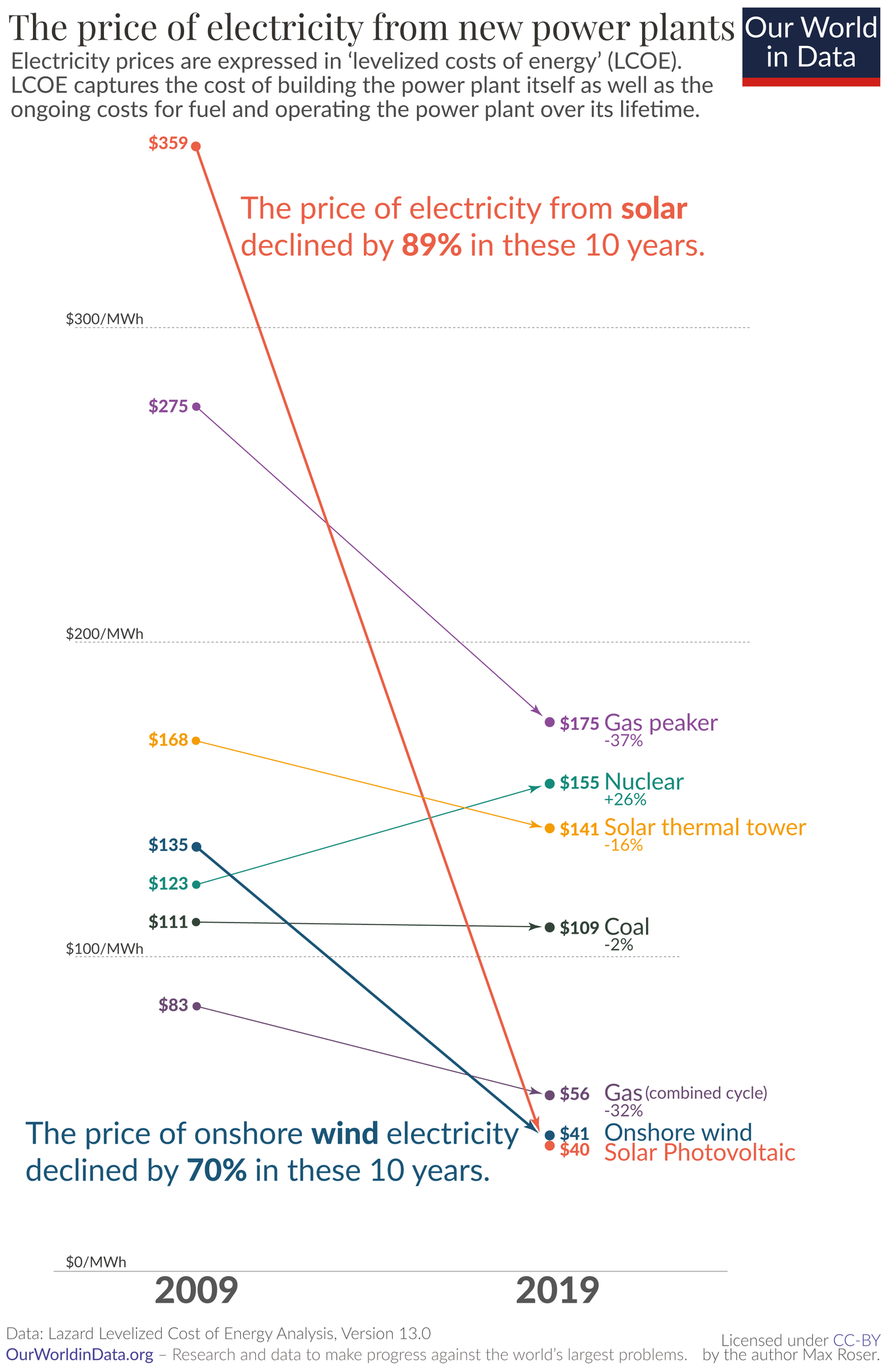
Solar now being the cheapest energy source made its rounds on Lemmy some weeks ago, if I remember correctly. I just found this graphic and felt it was worth sharing independently.
Without saying anything about politics, environment, or source:
Why, for the love of Satan, does this graph have only 2 data points per source?
Why use a line chart 📉 for that?
This is clear bar chart territory 📊.
deleted by creator
It’s called a slope chart and it has several benefits compared to bar charts:
I for one think this is much better than using a bar chart for this use case, as the angled arrows make it immediately obvious the information that matters the most here (the rate of change) while still keeping it contextualized (by relative positions). The bar chart version of this would inevitably look more cluttered and would not be more effective in conveying the incredible progress in solar costs.