- cross-posted to:
- datenvisualisierung@feddit.de
- wolnyinternet@szmer.info

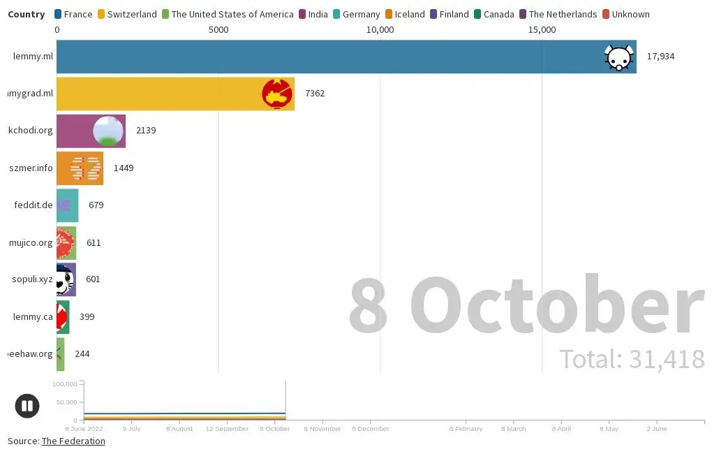
Two timelines I created of the total users at the top 10 Lemmy instances as a bar chart race and as a line chart. The line chart only includes the current top 10 Lemmy instances as of the 9th of June 2023 because Flourish only allows ten lines at a time.
I used the Federation to determine the current top 10 Lemmy instances as of the 9th of June and the 14th of July 2023. The website only has sorting function for the current data, and the instances have to opt in to be included. Therefore, it is likely that some instances are not included. Furthermore, the website seems to only contain data from the last year, so the website do not have documentation on the top instances prior to this period. Additionally, I excluded instances that have had quick growth in total users but not in posts and comments.
Yes, I plan to update it again after the 8th of July.
If you do update the post, maybe consider using an animated line graph. I find those usually show the change over time a lot better, because you see the total history of user count.
I think the bar graphs are really nice to show changes in the top position or when there are a lot of different „participants“ coming and going over the time of the graph.
Anyway, really nice animation. Only wanted to give my 2ct.