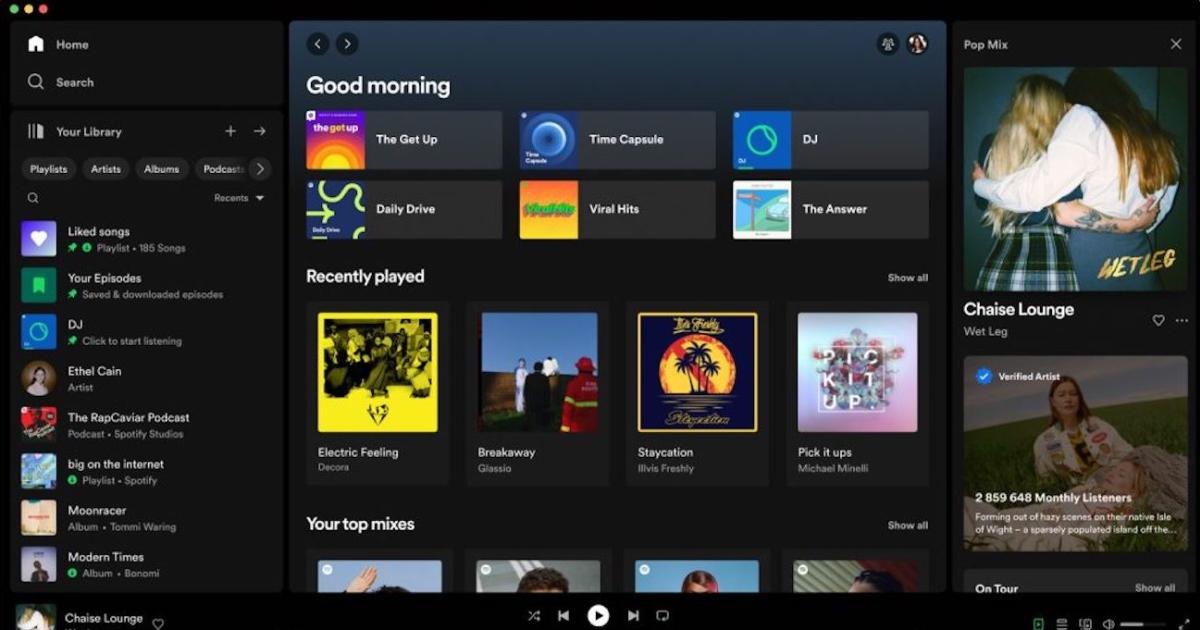

Spotify has updated the desktop app with plenty of visual improvements and new features, like a “now playing” view that gives you immediate access to merchandise and tour dates.
Spotify has updated the desktop app with plenty of visual improvements and new features, like a “now playing” view that gives you immediate access to merchandise and tour dates.
Such an improvement in my opinion. 90% of the time I am browsing my playlists. Now, instead of getting 20% of the screen space, they get a generous 70% almost! This small change makes me want to use Spotify desktop again.
I have no idea how they came to this decision, or whether I’m in the majority, but it makes me wonder: did they finally start to use the app usage analytics to improve their UX? Like looking at the most used functions in their app.