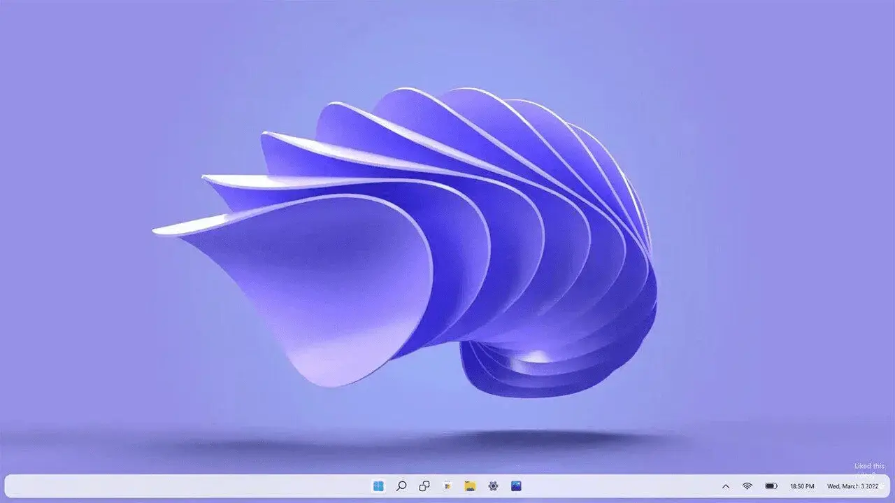
The Windows 10 taskbar is just better. The Windows 11 taskbar moves things to the middle by default for some reason, violating Fitt’s law, and removes several features of the Windows 10 taskbar without improving anything as far as I can tell. The new taskbar in the screenshot makes it even harder to click things by making them farther from the bottom of the screen, and makes the right side of the taskbar take up more space.
The new system tray is laughable. The icons cannot be that size. Imagine 16 icons of that size, but half of them are 24x24 or smaller icons scaled up.
One possible improvement with the new taskbar is that even though they have useless search and task switch buttons and the date+time takes up an unnecessary amount of horizontal space, they don’t have any of the other visual clutter like news and weather tickers.
The only reason I could possibly think a middle aligned taskbar is better would be for ultra wide setups. But even then, just make it a non default drop-down in settings and only a default if an ultra wide resolution is used.
Change for the sake of change. If it didn’t look significantly different, users would question why the upgrade. Doesn’t matter if they made significant, positive (being charitable here) change if the user experience didn’t change. Been there, done that.

Why do they insist on dicking around with the taskbar?
The Windows 10 taskbar is just better. The Windows 11 taskbar moves things to the middle by default for some reason, violating Fitt’s law, and removes several features of the Windows 10 taskbar without improving anything as far as I can tell. The new taskbar in the screenshot makes it even harder to click things by making them farther from the bottom of the screen, and makes the right side of the taskbar take up more space.
The new system tray is laughable. The icons cannot be that size. Imagine 16 icons of that size, but half of them are 24x24 or smaller icons scaled up.
One possible improvement with the new taskbar is that even though they have useless search and task switch buttons and the date+time takes up an unnecessary amount of horizontal space, they don’t have any of the other visual clutter like news and weather tickers.
The only reason I could possibly think a middle aligned taskbar is better would be for ultra wide setups. But even then, just make it a non default drop-down in settings and only a default if an ultra wide resolution is used.
Personally on a 1440p monitor or better I think middle aligned is better 🤷
That would make sense. Ive always played at 1080P or 4K (upscaled). So realistically…i have no baseline.
Just that 1080p is fine to have it left aligned.
Change for the sake of change. If it didn’t look significantly different, users would question why the upgrade. Doesn’t matter if they made significant, positive (being charitable here) change if the user experience didn’t change. Been there, done that.