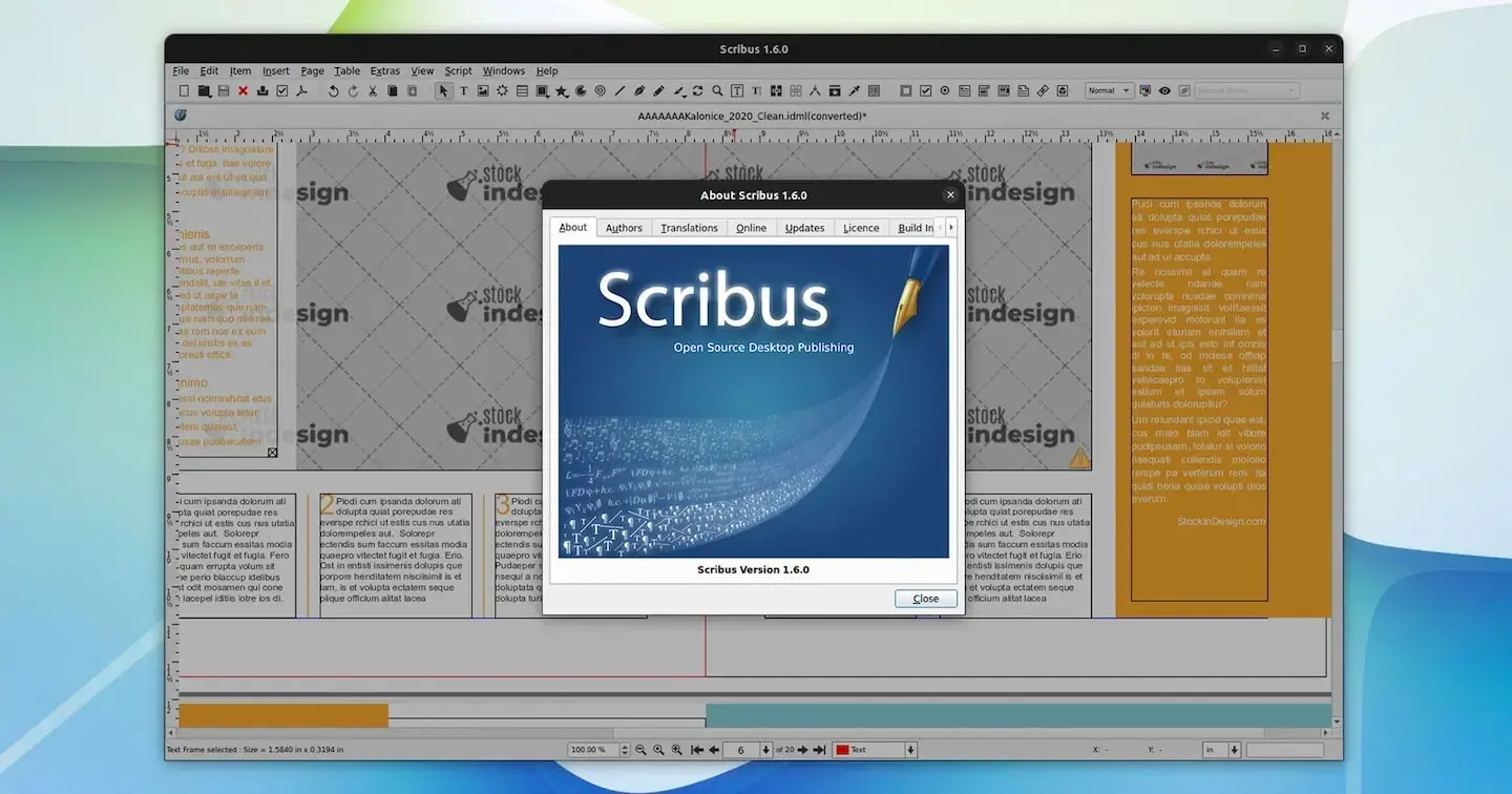
I want to like Scribus, but every time I hear about it getting updated, I download it, open it, only to find these tiny toolbar icons that have no apparent way of being made bigger. This is always what prevents me from trying it out! Seems like kind of a basic design no-brainer. Grrr. Does anyone else have this problem? I’m on Linux if it makes any difference.

This is my exact situation! It’s not just uncomfortably small, either – it’s flat out unusable. I think its a hiDPI issue, but from the forum posts it sounds like its been an issue for 5-6 years. I even tried changing the QT startup settings, but no luck.

Scribus has been around for a while, their UI looks like older versions of Microsoft Office. If you hover over the icon it will tell you what it does.
Maybe I’m older than you but scribus feels like comfort food, it isn’t loud and flashy and lets me focus on my work. I really don’t like the gigantic touch friendly buttons on desktop apps personally, so I hope they don’t go that way.
I cannot see any settings to change the toolbar size but I’m not a scribus wizard either.

It reminds me of Pagemaker, but I’m old.

I love that you can apparently now directly import .kra files from #Krita that’s very handy!


