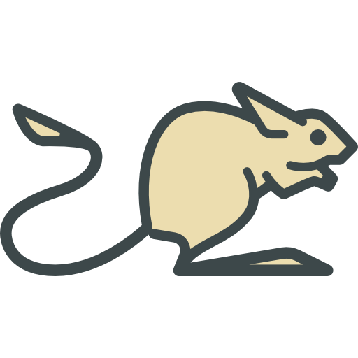
The app icon looks much less polished than the app itself. How about we change that?
You must log in or register to comment.
One of the great traditions of FOSS is its refusal to adopt that corporate visual design ethos which turns every logo into an abstract solid-colour silhouette optimised for mobile rendering. I like GIMP’s plucky rodent, for example. A counter-example would be the sad [d]evolution of the Firefox.
[deleted]
Any ideas?
I like it as it is.
Change the icon is the first thing that I have thought and I tried to create one. But a jerboa is so difficult to make as a good icon :c
The icon has an animal which is known as ‘Jerboa’. But in Android one of the easiest tasks is to change the app icon and its name into any.
Yeah, but that won’t affect e.g. the icon of this sub.