

I’m biased towards Y2K from the nostalgia, since those were the prime years of my childhood right before my teenage years kicked in.
But, I love the design of that time because of how obsessed with futurism everything was. It took the future chic look of the mid-late '60s and revamped it, taking that hype for the future- with the Space Race- bringing it back, and updating it for the Information Age.
It felt like we, as a society, had so much optimism for the world that was to come. So, if anything, I think that’s what I’m mostly nostalgic for. I was so excited to grow up in that world. Damn.
It felt like we, as a society, had so much optimism for the world that was to come. So, if anything, I think that’s what I’m mostly nostalgic for. I was so excited to grow up in that world. Damn.
As with anything regarding the past, there’s a lot of rose-tinted glasses going on. Be careful what you wish for
Me too, on the design, what I like about it is it wasn’t the ultra clean look futurism of the 1980s it was sort of collided with grunge.
Flat design is clinical depression in graphical form, a reflection of the contemporary existential/mental health crisis. It’s a societal cry for help, basically.
Seems more a rejects of the flamboyance of the prior two generation which will certainly give it a different feel. It absolutely felt fresh at the time of inception.

You know the worst part about flat design? Fucking “hamburger menu”. Fuck that shit.
The second worst part? “Text? Lol get real, old man!” Menus that don’t have text so I have to guess what the fucking icons mean on every different app/site.
Ditto on the no text part. That is an accessibility failure that’s way too widespread.
Sometimes I’m afraid to even push a button: does this delete my thing, or does it do some other irreversible change? Will I be able to tell what it did? Maybe it does something completely different, or maybe I’m lucky and it does in fact perform the action I’m looking for and which in my mind is a no-brainer to include?And it’s infected interpersonal communication too - people peppering their messages with emojis, even professional communications. It not only looks goofy, but is either redundant (when people just add the emoji together with the word it’s meant to represent - such a bizarre practice) or, worse, ambiguous when the pictogram replaces the word and the recipient(s) can’t make out what it depicts.
The most fun is when it’s a mix - the message contains some emojis with accompanying translation, some without.
I prefer the hamburger menu way more.
But what I really prefer on desktop is the ribbon menu that MS uses in their office suite.
I don’t share the hate for flat design.
It’s cleaner than the others, simpler and less distracting. Easier on the eyes, too. It takes itself seriously and does so successfully imo (nice try, aero). It feels professional in a way all the previous eras don’t - they seem almost child-like by comparison.Modern design cultivates recognizable interactions by following conventions and common design language instead of goofy icons and high contrast colors. To me, modern software interfaces look like tools; the further you go back in time, the more they look like toys.
Old designs can be charming if executed well and in the right context. But I’m glad most things don’t look like they did 30 years ago.
I’m guessing many people associate older designs with the era they belonged to and the internet culture at the time. Perhaps rosy memories of younger days. Contrasting that with the overbearing corporate atmosphere of today and a general sense of a lack of authenticity in digital spaces everywhere, it’s not unreasonable to see flat design as sterile and soulless. But to me it just looks sleek and efficient.
I used to spend hours trying to customize UIs to my liking, nowadays pretty much everything just looks good out of the box.The one major gripe I have is with the tendency of modern designs to hide interactions behind deeply nested menu hopping. That one feels like an over-correction from the excessively cluttered menus of the past.
That and the fact that there’s way too many “settings” sections and you can never figure out which one has the thing you’re looking for.P S. The picture did flat design dirty by putting it on white background - we’re living in the era of dark mode!
Every era is defined by the tools we had at hand during that process. While Memphis is basically pixel art, Y2K was defined by the gradient and mask tools on Photoshop, and Aero was a victim of skewmorphic design trends pushed by the commodity of 3D tooling. Flat design took prevalence because raster-based products felt weird when seen on retina displays.
I wonder how design will be affected when AI tools become the norm.
Everything will have extra fingers.
Seriously tho I think there will be a flight to intricacy.
Memphis was not pixel art.
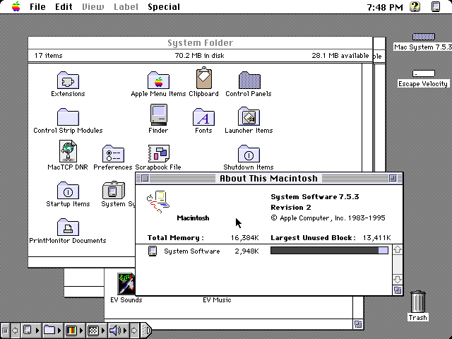
Windows/BeOS/MacOS 6 to 9
If you hewed to the ops memes incorrect description, Memphis would have been the 80s and mid 90s. It’s interesting that the meme takes into consideration the concept of the long 70s but then just goes back to ten year distinctions. windows 3 (I assume you’re not talking about the early dos shell stuff because no one ever is and you put it squarely amongst the contemporaries of 95, but I’ll give the benefit of the doubt since we’re talking design language) went from ‘90-2003 (with ME) macos 7-9 spanned ‘91-2001 and beos was 95-2000.
It’s possible you aren’t sticking to that flawed understanding though, so let’s talk about design language and Memphis. You’re right that designs are informed by their tools and mediums. For Memphis group those tools were drafting paper and those mediums were chipboard and naugahide. Memphis group made couches and shelves, not software or digital art.
Now that’s not to say that only stuff from a specific cadre of Italian designers made during a short period is Memphis and everything else is sparkling crayon scribbles, only that the stuff we actually recognize as Memphis wasn’t pixel art by any measure.
Most of what is in the meme under Memphis isn’t even Memphis though, it’s pop art. I think the pants are a haring print…
With all that said, what about windows (were you talking about windows 3+?), macos 7-9 and beos would you say were sparkling crayon scribbles, pop art or genuinely drawing from the design language of the Memphis group?
I was taking about icon packs. I didn’t know about the Memphis designers, thanks for the nice write-up
It would be cool to have as much information about the icon design and window decorations of those oses as we have about the windows startup sound (look the making of that up sometime if you want to know the absolute heights of decadence software development hit and what Microsoft could do when they were really trying to compete with Apple).
Reading back, I was a jerk in my response to you, getting all “well actually” over a meme about 90s kids because it used the wrong name for the language of different designs.
Mea culpa. Im sorry.
all good! :pixelated-hug-emoji:
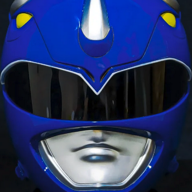
Aero: I liked the 2010-ish design best even though I was at least 20 at the time. I just found Memphis and y2k a little goofy. Win XP or this fish glass Mac are the worst for me.
Maybe someone who is too young to have lived in the 90s finds this novel, I don’t know.
Someone has written it here. There was at least some techno optimism left in 2012 or so and maybe that’s the time I am nostalgic for.
Not so much the 90s “because we had no phones” - then turn your phone off.
Not so much the 90s “because we had no phones” - then turn your phone off. >
Whish it was that easy…

You may not like it, but this is what peak performance looks like.
Flat design is just soulless crap
I gravitate towards the ones I came up in, and that’s probably not a coincidence. I will say that flat design becomes self-defeating sometimes. Every damn Google icon looks the same.
Needs a few earlier movements, including Art Deco/jazz moderne, Bauhaus and midcentury modern/googie
The next generation of design is already taking shape. It’s a simplistic skewmorphic design, where it looks like the logo has been made out of clay. Look at the new Reddit and Android logo.
So basically IOS’s design language prior to IOS 7
Frutiger Aero was when design peaked
I like flat design.
I feel like everyone here just prefers the design they grew up with.
Yeah, the 90s are in style right now. A few years ago, we were all cringing st the styles we wore/had in the 90s. Now it’s hip. In a few years, the early 2000s will be back in style, and everyone will think the 90s is tacky again.

I’m a big fan of flat design, too. To be fair, I basically loved every style in its time. Regardless, I like flat.
I remember being stoked when IOS 7 came out because it looked so much better when the design was overhauled to be flat.
I personally don’t like Aero too much. Win 7 looks decent but I prefer the look and simplicity in Windows 10.

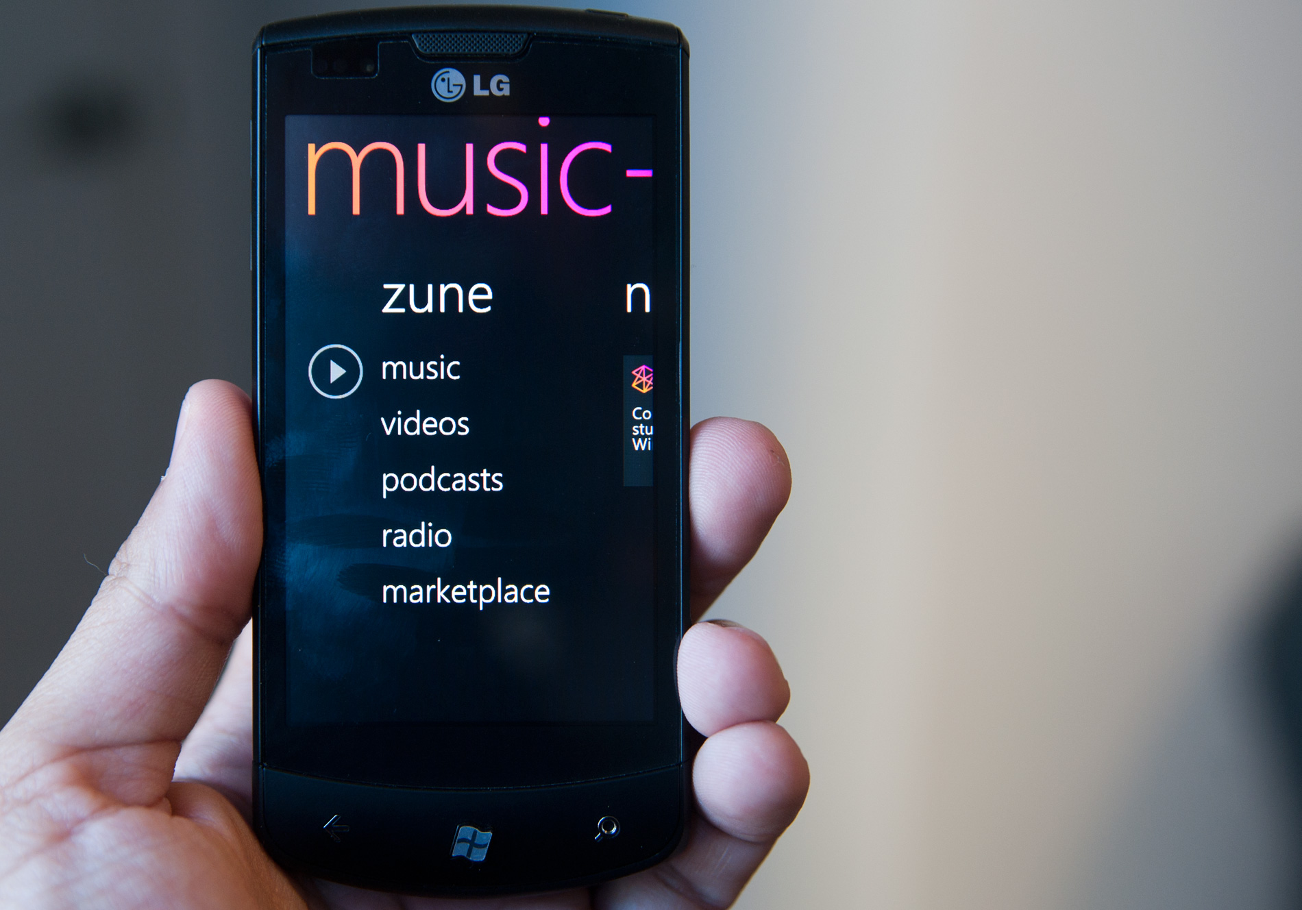
Early flat design, around the WP7 era, was good. Modern flat design has a lot of wasted space and a lack of descriptive text :<
Later
- Fizz ( @Fizz@lemmy.nz ) 10•4 months ago
Aero looks futuristic and sleek.
not sure, but I do know that “flat design” is absolutely the fucking worst.