

cross-posted from: https://lemmy.world/post/18796438
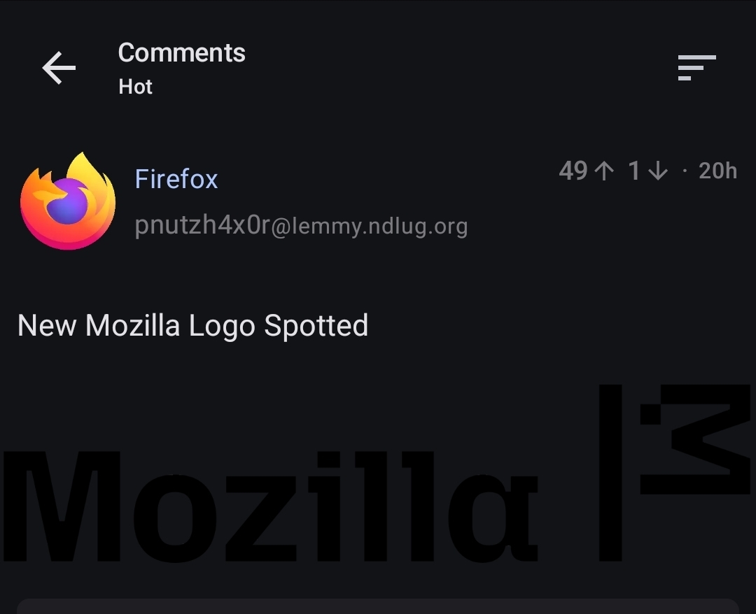
Spotted by: https://www.soeren-hentzschel.at/mozilla/exklusiv-sehen-wir-hier-das-neue-mozilla-logo/
Related Article: Mozilla’s New Logo Brings Back the Dinosaur Mascot (Kinda)

I much preferred the moz://a logo, its such a clever concept for a web company

I also like that it’s possible to type moz://a into Firefox and it works.

Man, that is just such a cool little easter egg. Totally love it!

Is this an early or late April Fools?

Are they just… waving a white flag as if they surrender?
I kinda like the current
Moz://alogo.
It’s transparent. Probably shouldn’t be

        _
      _(·)<
      \__)
Logo looks like a Llama with dementia.
Now I can’t unsee it
Thanks I hate it.

Not claiming your opinion would be wrong. But I honestly don’t know why one would hate it (not joking if it sounds like :D) .
I much preferred the moz://a logo, its such a clever concept for a web company
i really liked the old :// part in the logo. I even made a post here based on it earlier.

Holy cow, what an ugly font.


Bring back red dinosaur! /s
What font is it? Not the Fira nor Fira Code.
:V