
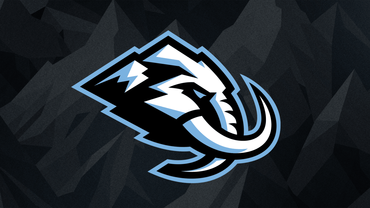
I have mixed feeling. Colours don’t feel unique. Logo looks like the Predators and Wild had a baby. And the chant in the rink will be “let’s go mammies” which sound pornographic ;)
But, it could have been so much worse.
Reminds me of the Sabres logo on the left.
I thought they should have just stuck with Utah hockey club. Kinda unique for a hockey team to not have a “name”.
Not to be confused with the Colorado Mammoth box lacrosse team 😂
Kidding aside I like the name and color scheme. Nice work Utah
deleted by creator
Mammoth or Mammoths since there’s more than one player?? LOL
What’s the name of the band? The Lone Rangers? There’s three of you. You’re not exactly “lone.”
They need to release a calendar of their most hirsute players to mess with the Mormons. No other reason.
I dont mind the name, but im having second thoughts about the colors. At first I thought the Ice blue was a little different but honestly, I just get them confused with Seattle half the time… Why does 3/4 of the league have to be Red, or Blue?
I especially do not like the Away jersey.
I know hockey in Arizona was Cooked, but these are a massive downgrade from the Coyotes, both of theirs, the Kachina and the Maroon/Black howler jerseys.