
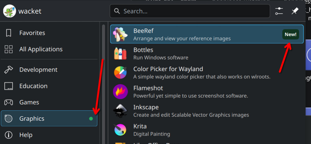
I think it’s still an interesting question whether this feature should be enabled by default (and most people seem to agree it should be).
If it wasn’t on by default, the kind of person who would benefit from it wouldn’t discover it.
I think it’s a great feature. I can now quickly find the thing I just installed in my menu.
Yeah. Plus they immediately got a reply from someone showing where you can turn it off in settings.
I was very annoyed when I got this, but remembered that it’s KDE, and turning it off is 4 clicks. Proprietary software often doesn’t allow you to turn this off (easily). Windows has this “feature”, where is the setting?
I don’t think it’s a productive “feature”, but considering it can be turned off so easily I don’t consider it a complete showstopper.
It sounds like the author of the article is more concerned with the incentive it creates for developers to push useless or sloppy updates (“impact driven development”) than the UX.
How does this give incentive for that?
My understanding is that this only happens in newly installed apps, not recently updates ones. They are only highlighted because the user installed them, not because the developer did anything.
It’s a screenshot of the application launcher, the menu to launch apps already installed, not the software store.
My mistake if that’s the case.
I’m glad there’s a toggle, it seems like it would actually be useful here but I’d probably turn it off.
With that said, there’s a special place in hell for the multitudes of apps that have red notification dots all over the UI with no clear indicator as to what they’re about or how to clear them :D
Yeah, I hate those little dots and I inevitably jump through the hoops until I’ve clicked enough things to make them go away.
Funny little read there.
There is a setting, but I was equally annoyed that it is on by default.
Even more surprising - when I launched the new app miltiple times, it was still marked as new.
It’s probably time based.
And this kind of thing isn’t for the type of people who mess with settings. If this defaulted to off, then it would actually be useless.
If this defaulted to off, then it would actually be useless.
Would just be the other way around with what posts you see online. Instead of OP you’d see “how can I find my newly installed apps” and the same “ahem” screenshot reply.
Except that if people don’t know the feature exists, they might not ask about it. If you see the feature exists and you don’t want it, it is easier to figure out how to turn it off.
There are many feature that are turned on by default - this is just one of them.
I see plenty of posts here, on the kde matrix, on the kde forums, on the bugtracker asking for non existing features.
I have no clue about the exact percentages, their motivations or feelings, so it’s hard to conclude anything.
Personally, I more often ask for nonexistent features (and i feel no barriers there) than turning off something that is on by default - which is a good sign I guess?
But you don’t see all the people that does not ask for features, but could benefit from them. I worked IT support for years and I often suggested features or different workflow to users because I could see they were doing things that could be done easier.
I find this complaint very strange. It’s a dot. It helps people find what they installed.
But if this person doesn’t need it, how would they ever see it? Most power users I know never even look in the menu, so they would never know there is a dot in the first place.
Hahaha, what a great way to start tuesday morning.
deleted by creator
Some apps have weird names and I forget what they’re called. Showing a “new” badge, even if it’s just for the first few times I open the app, makes it more likely that I’ll remember the app’s name.
deleted by creator
You can set most KDE menus to show the “Comment” key of the .desktop files instead of the “Name” key. So “KDE Advanced Text Editor” instead of “Kate”.
Packages can come with several “programs” that aren’t necessarily named the same as the package. Example: Calibre installs menu items for “Calibre”, “EBookViewer” and “EBookEditor” on my distro.
It’s not about forgetting…it’ about helping to quickly find what you just installed and what is all included.
OP specifically said “forget”, that’s what I was referring to.
I dunno man.
It’s not like linux applications ever have different app-names in the menu, when compared to the package name you just saw when installing it.
That has never tripped me up. No. Never.
/S
I install graphical and visual design apps. And I’ll navigate to the category by mouse. I don’t memorise the names of all my apps. I’m not in IT, and I’m not working with text all the time. I’ll right click the app icon and go ‘Add to favourites’, so I have a highly productive, 1 click access to important apps. I’m interested in usability, am not a beginner and I know my UI and settings well. I can see why people find this tiny green dot useful. It’s OK if you are not into usability. But note that there are many different user types, with different needs at different times. And the flexibility of KDE Plasma makes it a really great desktop environment.
deleted by creator
It’s more about which category a particular specific software belongs. If a kid installs an educational app/game that teaches programming by giving instructions to a turtle in order to draw a graphic/picture (I think I have seen something like that before). Which category should it be? games? education? development? graphics?
I personally don’t use this kind of menus with categories, I prefer dmenu style launchers where you type to search what you need. But if I was the kind of people that do use this kind of menus I would probably find that kind of indication useful.
You are right, the marker at the category level definitely makes sense to find the application initially.
Are you trying to bribe the devs to remove a harmless feature that can get turned off with two clicks?! Seriously??