I cannot explain how much I do not want to see this green dot and “New!” text in my application launcher. Rather than be a passionate contributor like you, I have regrettably become a slave to the Big Tech industry - But one thing I can provide is insight into why operating systems like iOS and Windows have this noise: Impact driven development People need to justify their work on a continuous basis, with the upside of promotions and downside of layoffs. They add the most useless feature...


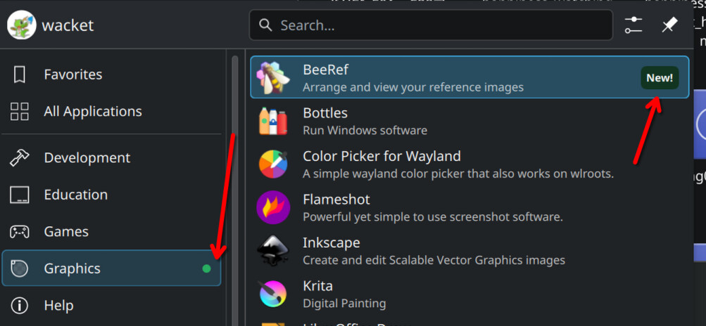
How does this have anything to do with “impact driven development”?
I think the person is either misunderstanding the purpose of the indicator or has PTSD from seeing that kind of highlights somewhere else. This only highlights what the user has installed recently so that they can find where in the menu was it added. It’s tied to user action, not the developers of the app doing any update or anything like this…