
It doesn’t look half-bad, actually! :o

It looks kind of short and wide to me. I know it’s totally subjective but I prefer taller fonts like Iosevka and Pragmatica.
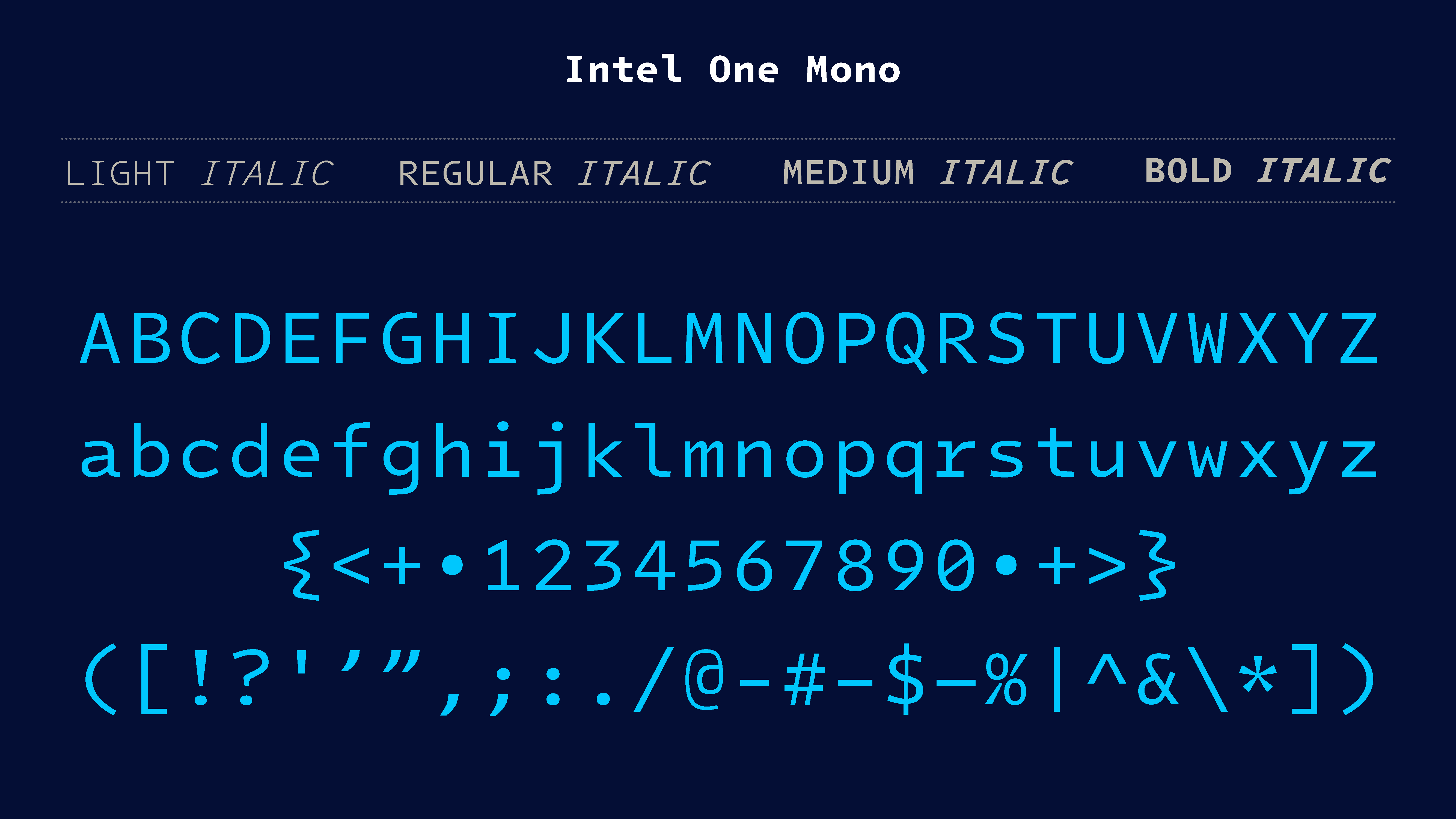
I don’t know tbh, it’s not bad but the curly brackets really throw me off?

I didn’t even notice until you pointed them out… yeah, that’s pretty ugly!
Right? They feel out of place when compared to the rest of the brackets. Everything else is pretty minimal and they just come in swinging

Direct link to the GitHub for those that feel lazy to go through Slashdot: https://github.com/intel/intel-one-mono
It looks nice I guess, but I like ligatures and I like narrow fonts (so you can fit your 80 columns into a smaller window), so I’ll personally remain a Iosevka slut for now. The idea of an accessible font for low-vision devs is great, though.
It’s not bad looking for the most part, but IBM Plex Mono already hits it on the nose; you’d have to rip that font out of my dead hands.
